Wednesday, December 21, 2011

Intelligent Reporting on fluid data sources using Analyzer

I'm reading: Intelligent Reporting on fluid data sources using AnalyzerTweet this !

Microsoft Excel is one of the most widely used tools for a variety of business purposes, due to its simplicity, calculation abilities and efficiency as a client tool for accounting purposes. Excel is the tool of choice for not only business users, but for a wide variety of users, right from field engineers collecting data from at the ground level to power-users validating and accounting for this data. Excel worksheets loaded with thousands of records are a huge source of data. But Excel is not meant to be a database management system or a reporting platform either.

Traditional data warehousing methodologies involve developing relational warehouses that are populated from sources using an ETL process – Extract, Transform, and Load. Data from these relational warehouses are processed and stored in analytical databases, which host cube and other data structures. SQL Server 2012 introduces tabular mode Analysis Services and the new Business Intelligence Semantic Model to deal with this scenario. This model requires usage of a new query language known as DAX (Data Analysis eXpressions). As it is a complex process to transform relational data into a dimensional model to facilitate robust analytical capabilities, business users often have to accept tradeoffs and constraints on their ability to perform analytical reporting. These tradeoffs are due to the limitations associated with provisioning data in analytical form. In this Analyzer recipe, we will take a look at what features Analyzer has to deal with this challenge.

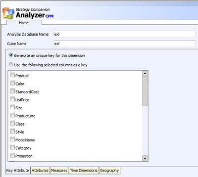
The latest version of Analyzer introduces a new feature known as Data Packages to deal with the scenario discussed above. This feature provides the user with the ability to upload their data in Excel / Access file formats. After upload, options are provided to create a model for reporting, and the same model is created as an analytical model for intelligent reporting. Consider you have products-related data from Adventureworks in a flattened Excel file, having 60K records and a lot of fields. After the file is uploaded, all the attributes are listed as shown in the below screenshot. All the attributes are grouped in a single dimension by default. Dimensional modeling requires every unique entry to be associated with a key attribute. This is taken care of by an option to generate a unique key.
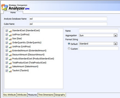

The Attributes tab facilitates selection of attributes for the dimension, and the Measures tab allows selection of measures. All numeric fields are identified by default as measures. Time is one of the most important dimensions in any dimensional model. Fields having date / time are identified to be configured as the key for a time dimension. Once the model is configured, it can be saved for later processing or can be processed in place. After processing, Analyzer creates a dimensional model and deploys the solution to the SSAS instance configured to be used with Analyzer. Apart from attribute selection, the entire process of deployment is entirely transparent to the end-users.

One important point that comes to any seasoned SSAS practitioner’s mind is how users would browse attributes. For example, Category -> SubCategory -> Products is a logical and natural hierarchy. Two questions that arise are 1) How would the users know whether a hierarchy exists? 2) How to build this hierarchy? When the model created from the uploaded files is deployed to SSAS, a dedicated database is created for it. If the database is opened using BIDS, it can be easily edited to enrich the model and build a hierarchy. The best part of the entire Data Packages solution is that the model is deployed as a normal SSAS solution and no proprietary encrypted code is injected, as seen in the below screenshot. This allows you to use BIDS with the Data Packages feature, should you wish to enhance an Analyzer-generated cube. Creating such a hierarchy would give a clear visual clue to the user of how to interpret and use the data, but creating the hierarchy would typically require intervention from the IT department as an end-user cannot be expected to accomplish this.
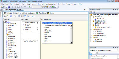


Even if the end-user does not have that support from their IT department handy, it is not a show stopper. Users might not get the visual clue of a hierarchy, but if users are well informed of the data they intend to analyze (which they should be) then Analyzer works on the intersection of fields and provides the same data browsing and reporting experience with/without a hierarchy in place.

The below screenshot displays the hierarchy of products on the rows axis, and it has Country->City on the columns axis. Without even creating a SSAS hierarchy, based on the association of data, Analyzer detects the relationship and displays data in the same way. From a fluid data source like Excel, which has fluid data types and virtually no metadata, Analyzer creates an analytical model transparently. Once the model is available, users can benefit from the intelligent reporting capabilities of Analyzer, without the time and resource-consuming hassle of the IT-supported provisioning process.
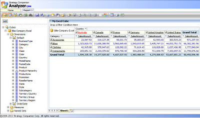


Without even a BISM, Analyzer has its own version of a BISM that works transparently for end users and equips them with analytical models on the fly for intelligent reporting capabilities. One of the main differences between the two is that the Analyzer “BISM” works with any version of Excel and does not require SharePoint or SQL Server 2008 R2 or SQL Server 2012. To find out more about this exciting and unique new feature, download an evaluation version of Analyzer.

Sunday, December 18, 2011

Difference between DirectQuery and In-memory mode in tabular mode analysis services

I'm reading: Difference between DirectQuery and In-memory mode in tabular mode analysis servicesTweet this !
Tabular models are one of the new enhancements coming in SQL Server 2012 especially with tabular mode analysis services. Querying data from these models is available in two modes: DirectQuery mode and In-memory mode. Those who are well versed with Multidimensional mode analysis services can grasp this very easily. DirectQuery mode is synonymous to ROLAP mode and In-memory mode is synonymous to MOLAP mode. DirectQuery reads data right from the relational data source while the in-memory mode queries data from the memory cache. Both has its own tradeoffs and benefits. More on the same can be read from here.

Interesting part about tabular models and these mode of queries is linked to a different fact. In SQL Server 2012 tabular mode analysis services, analysis services tabular projects can have just one model per solution. I find it a very serious limitation. But the data sources from where data can be sourced is immensely huge, and the list includes sources like Parallel Data Warehouse and ATOM feeds including SSRS reports too. This open up a huge range of interesting possibilities when these modes of querying data is linked with these data sources. For example, Parallel Data Warehouse can be linked to a tabular model, which in turn is used by an SSRS report as a source. Using DirectQuery mode, SSRS can fetch data from Parallel Data Warehouse in real time. This is one such example, but there are a huge range of interesting possibilities that these two modes can open up with interesting combinations of data sources. Check it out yourself.

Tuesday, December 06, 2011

How to install PowerView ? Why Data Alerts and Powerview are not available in native mode SSRS ?

I'm reading: How to install PowerView ? Why Data Alerts and Powerview are not available in native mode SSRS ?Tweet this !
This blog has been silent for quite some time. I am recovering from an accident, a few turbulence in personal life including laptop crash. I am also busy these days in my new book authoring assignment. I would like to keep the details of the book under the covers, till the time gets mature to announce it. SQL Server MVP Deep Dives Volume 2 got released last month, and I have authored a chapter on this book titled "BI solution development - Design considerations". Coming back to business, this is my blog post after a long break from blogging.

SQL Server 2012 RC 0 got released by Microsoft 2 weeks back, with a deadly bug on Distributed Replay Controller in the setup. Due to this bug I had to skip installation of the component itself. SSRS enhancements is sharepoint integrated mode are shipping two new kids - Data Alerts and PowerView which was formerly known as Project Crescent.

1) I have been receiving queries from many developers on how to install PowerView and how to verify whether PowerView is installed. The answer to this question is, if you have installed SSRS Add-in for Sharepoint products on your Sharepoint farm, consider it granted that PowerView has been installed. This component is the one responsible for installing Data Alerts, PowerView as well as the entire user interface related to SSRS in sharepoint. Keep in view, PowerView and DataAlerts are silverlight based applications and can be operated only in a browser. Simplest way to verify whether powerview is installed, is by deploying a shared dataset on a sharepoint document / reports library. Select the drop-down options for this shared dataset, and you should find an option named "Create PowerView report".

2) Why PowerView and SSRS are not available in native mode SSRS ? Question is very valid, as Reports manager is also a web based application that queries SSRS web service. If these silverlight based enhancements are intended to be made available in native mode, I don't see a technical challenge to it. But these enhancements are packed only with the add-in, which means they are strategically intended to be made available only in sharepoint. So to me it seems more of a business decision than a technical decision. Affording Sharepoint just for a client tool is too heavy, is the reaction that I have been observing from the community. Let's see how community reacts to it in the long term.

I promise my blog readers that I would try to come up to speed on blogging as soon as possible. Keep writing to me.

Wednesday, October 19, 2011

Operational Data Analytics using Analyzer

I'm reading: Operational Data Analytics using AnalyzerTweet this !
Any quantitative data analysis would mean that there are a huge number of data points to analyze using visualizations and derive meaningful readings from this sea of data. A major part of the reporting world is composed of analysis of operational data, compared to analytical data. Reporting and analytics solutions are not meant just for the most elite management audience, instead operational reporting and analytics is one of the biggest areas where analytics can help to improve business processes. At this level of data analysis, generally the reporting constituency is formed of very simple visualizations for data representation, for example simple charts and graphs, grids, etc., and the target audience cannot be expected to be skilled enough to use advanced visualizations using sophisticated statistical formulas for their derivation. But that does not mean that there is no need for any advanced reporting solution in this area, as the reporting requirements are pretty basic.

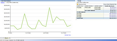
In this Analyzer Recipe we will take a look at how an intelligent reporting solution can bring that difference to operational data analytics with simple though effective sophistication. For the purpose of discussion, we will take as an example Line Chart Analysis. Line Charts typically draw a graph connecting a series of continuous data points. In the below screenshot, you can see a simple report I have created using a simple line graph and pivot grid. The chart contains a reasonable number of data points for reseller sales amount. The same data is also represented in the grid for a detailed view. The immediate question that should come to the mind of regular users of such reports is, what more can be improved in such reports? We will look at that now.


Many would not know that a more sophisticated form of line chart is the spline chart. Say your capture systems have acquired limited and non-continuous operational data, and you intend to create an intelligent trend out of your limited data. The spline chart is an intelligent option that would fit a curve through your data. With just a simple change in the graph type, the report would look like the below screenshot. If you compare the graphs in the above and below screenshots, you would find that the increase and decrease in the data is shown much more minutely in the spline graph compared to the line graph. You can use the grid to confirm this. For a better experience, try both graphs with non-continuous data, and in that case line graph would not give you a continuous curve, whereas the spline would provide a smooth graph out of your non-continuous data.


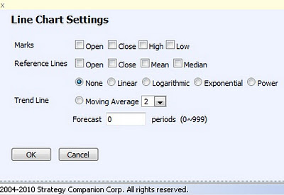
Analyzer charts provide interesting and advanced options for line charts (as one example of many chart types available) as shown in the below screenshot. So users who excel in sophisticated operational data analysis, can bring in the required scientific analysis using the below options, without the need to migrate from their regular graphs that might be used by a broad category of operational data analysts. In this way the more basic needs of the general user are taken care of, while at the same time enabling the “power users” to do their own advanced analysis and reporting, using the very same tool.


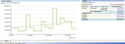
By changing the chart type to Step Line Chart, which is a more sophisticated form of a line chart, and including a trend line for linear moving average using the options shown in the above screenshot, an interesting trend can be created out of the operational data which is not that clearly visible in the above two types of line charts. With the moving average reference, analysts can always see whether the trend is constant compared to the moving average, which would not be that clear in the absence of this reference line.


In my views, the real power of a reporting solution lies in the ease and effectiveness with which it can make that data visible to the users that is not instantly visible to the human eye. Also, when users do not need to train themselves (or worse yet, go to a training class) to use sophisticated visualizations, and they can continue with their regular tools of the trade which provide an acceptable level of “polishing”, users will be able to adopt and use the reports and reporting solution with the impression that it’s their regular analysis tool with a flavor of modernization in it.

We saw how a line chart can be easily converted to a spline chart for analysis of limited data and better curve fitting purposes, and how this can be converted to a step line chart for better trend analysis with advanced scientific options. Analyzer has many more other such chart types and options, and you can visit the Analyzer web site to explore them more.

Monday, October 17, 2011

Excel Services data source in Performancepoint Services 2010, Hadoop Data Source : New breed of data sources

I'm reading: Excel Services data source in Performancepoint Services 2010, Hadoop Data Source : New breed of data sourcesTweet this !
Data is the only currency that is generated every second in IT business and its the only currency that every business was to gather and utilize in the best possible way. BIG data and Unstructured data are creating tsunami sized data related challenges for storage, processing, as well as analysis. In the world of structured as well as unstructured data, more and more newer breeds of data sources are evolving and its good to keep a tab on these evolving breed of data sources.

We earlier heard the announcement related to connectors for Hadoop environments. In the new announcement made recently, Microsoft is now propagating Hadoop in its on-premise and cloud based platform with full integration with its regular line of products ranging from Excel to Business Intelligence stack. Hadoop, Hive, Pig etc are the new terms you would hear now in microsoft parlance too, and with this comes the new breed of data sources. You can read more about this announcement from here.

Even in the world of structured data, if you have a tab on the advancements happening in the Microsoft BI world, you would find newer category of data sources. One such example is Excel Services Data Source in Performancepoint Services 2010. Here's a tutorial on the same on Performancepoint Services Team blog. One service application acts as a data source for another service application, it is a very interesting concept in itself and opens up a new range of possibilities.

With SQL Server Denali, even SSRS would be deployed as a service application when you install it in sharepoint integrated mode. So by the integration theory we just discussed between two service applications, there is also a possibility in the future that PPS scorecards can be used as a data source for SSRS Reports, which has always been the other way round till date. With more variety of data sources, the newer challenge on the horizon is selecting the best way to source data as virtually anything can become source of data !

Tuesday, October 11, 2011

SQL Azure Federation Architecture Solution

I'm reading: SQL Azure Federation Architecture SolutionTweet this !
Federations is one of the most effective aspect of any architecture design, which basically provides de-centralization of operations, effectively providing parallelism, scalability, de-coupling and multi-tenancy. Cloud has become a dominant platform for any kind of architectures, and federations on the cloud for multi-tenant solutions are even more interesting and challenging. In Microsoft parlance, this would translate to SQL Azure Federations. A lot of reference material is already available on the same, so I would not go into explaining the same again. Below are some very useful links that answers some very important questions like:

1)
What are Federations ?
2)
What is Federation Architecture ?
3)
What kind of solutions can use Federation Architecture ?
4)
How to scale an application with SQL Azure Federations ?
5)
Sample application using SQL Azure Federations for multi-tenant solution
6)
Data Migration on SQL Azure Federation

Thursday, October 06, 2011

Tribute to Sir Steve Jobs

I'm reading: Tribute to Sir Steve JobsTweet this !
Edward Tufte and Stephen Few are two of the most famous names in the field of Information Visualization Design. But in my views Apple has done wonderful work in this field, and Sir Steve Jobs contribution in the field has been immense and which cannot be explained in words. Sir Steve Jobs needs no introduction, and this post is a humble tribute to him.


Monday, October 03, 2011

Powerpivot and BISM in SQL Server Denali

I'm reading: Powerpivot and BISM in SQL Server DenaliTweet this !
Business Intelligence Semantic Model (BISM) is the new philosophy in MS BI analytics parlance, that is taking shape in SQL Server Denali. Tabular projects and MOLAP with choice of MDX or DAX can be termed as a brief definition of BISM, in tangible terms. SQL Server Denali CTP3 ships with all the new features supporting and reflecting BISM in SSAS. But that is just one part of the world.

Powerpivot is the flagship product of microsoft for self-service business intelligence. And surprisingly, microsoft is aggressively inducing the flavor of BISM here also. Three major additions to powerpivot are:

1) Diagram View: To me this looks more like a DSV equivalent of SSAS. Though I have not tried hands on, but from what it sounds, this is a very valued addition to the tool. End users would enjoy modeling using a designer, compared to an excel kind of UI for developing models.

2) Hierarchies: The ability to create user-defined hierarchies would mean that user can logically arrange and relate entities, which can translate the user can easily envision and model drill-down and rollups on their data. Hierarchies are so essential part of any data model, and this capability would enable users to logically analyze their data.

3) Perspectives: This is not a new feature, and those who have used SSAS would definitely understand what this means. If powerpivot data models are shared on a collaboration platform like Sharepoint, this feature can be a real value addition and abstract relevant part of the models to relevant users.

There is much more than just the above listed features, that is being offered in Powerpivot for Excel with SQL Server Denali. To learn about the same, check out this link.

Sunday, September 25, 2011

Data change alerts in SSRS Denali and Performancepoint Services 2010

I'm reading: Data change alerts in SSRS Denali and Performancepoint Services 2010Tweet this !
Time is money and this philosophy turns into a requirements when it comes to reporting. RSS changed the way people access information, as one no longer needs to continuously poll the source of information to check for updates.

Reporting environments may start with a modest set of reports, but over the period of time the ecosystem may grow to a huge number of reports. In a BI environment, reports may range from dashboards showing very higher level trends and KPIs to basic operational reports filled with lots of numeric data. When the information has changed and What information has changed are two basic updates that any user would like to know, and check out the reports only then. Pushing reports at regular intervals into user's mailbox is a very inefficient practice, unnecessarily increases volume of data in an enterprise, and also creates lot of duplication. And if users have to open reports regularly and analyze whether any data has changed, even that is unnecessary load on the server resources.

Performancepoint dashboards and SSRS reports are the two pillars of reporting in MS BI stack of technologies.

1) One of the upcoming enhancements of SSRS Denali is Data Alerts in a sharepoint integrated mode installation of SSRS, which is facilitated using SQL Batch jobs that keep polling your data for changes based on the rules defined in the alerts. So users would get a notification when data has changed and only then users would have to bother looking at the reports along with clear indications of what has changed.

2) Bidoma alert is a productivity add-on for Performancepoint 2007 and Performancepoint Services 2010 from Bidoma.com. It provides alerting capabilities and reports on different constituents of performancepoint dashboards, basically scorecards and KPI data changes. More about this product can be read from here.

Tuesday, September 13, 2011

SSRS Denali enhancements in Sharepoint integrated mode

I'm reading: SSRS Denali enhancements in Sharepoint integrated modeTweet this !
I apologize to my blog readers that I have been very passive in blogging these days, but I am just recovering from some personal issues and getting on track. I promise to be back on normal pace of my blogging within a weeks time.

Advancements in SSRS Denali, as heard and seen in TechEd seems to be bridging the gaps that should have been ideally filled up in the R2 release itself. But its better late than never !!

1) The first gap that is being filled up is SSRS Sharepoint integration. Though integrated mode has been supported, but implementing this mode has required a cross IT team efforts. Also its a know fact that reports deployed on sharepoint integrated mode, have been found to be performing slower compared to native mode. In my understanding, SSRS Denali brings SSRS as a shared service in sharepoint, and effectively it would benefit from all the advantages of being a shared service in Sharepoint.

On the other side, alarming situation is that endpoints that used to work for sharepoint integrated deployment, might not work in the same manner with SSRS denali. This can be a major migration blow for applications accessing reports programatically from application servers using these endpoints.

2) SSRS Logs have been very limited to ExecutionView3 tables, and rest of the help was provided by tools like Fiddler to troubleshooting. In integrated mode, logging also seems to have been considerably improved.

3) Data Alerts is one of the new enhancements in SSRS Denali, which can be thought of a SQL Scheduled Job implementation that sits in Sharepoint DB, to watch over the change in data. This sounds very good, but it looks little risky from the way it can continuously trouble database servers to check for alerts, as I have not heard about how much control is available of the frequency of alerts.

4) Crescent is another flavor of self-service reporting, requires silverlight and works in a browser in Sharepoint only. Presentation of data looks like fancy, and even controls similar to motion framework for trend-analysis are being introduced in this tool.

5) SSRS Denali is also bringing better export options like ZIP formats, support for Office 2007 based export formats, better compression, better performance in sharepoint integrated mode and more.

From a higher level, most of these are welcome changes. But from an architecture standpoint, it would be interesting to see whether sharepoint integrated mode ssrs deployment, changes architecture in a big way and whether it brings dead end to seamless migration from R2.

Wednesday, September 07, 2011

Intelligent Distribution Analysis using Analyzer

I'm reading: Intelligent Distribution Analysis using AnalyzerTweet this !
Business intelligence reporting tools should be capable of analyzing massive amounts of quantitative data via categorization into distributed frequencies and groups. The intelligence expected here is facilitating analysis of data density distribution across various logically-related or unrelated groups, identifying outliers, quality control, identifying non-linear relationships between different business parameters, and beyond. This corresponds to a branch of statistical analysis known as distribution analysis.

For example, business assignments that are tracked using various project management metrics have cost performance index (CPI) and schedule performance index (SPI) as two of the tracked metrics. A large organization could have several hundred projects running simultaneously. To analyze how the business is performing on cost against schedule, data of all projects is categorized into clusters based on CPI versus SPI, and analysis can be done on clusters to derive the relationship between these parameters as well as performance of projects under different clusters.

Any intelligent distribution analysis starts with the study of higher level composition. In this Analyzer recipe, we would take a look at how a capable reporting tool can help with an interesting and intelligent distribution analysis, and extract insights.


The above screenshot is a typical example of time series analysis using the Adventureworks cube. Sales performance of different geographies is shown. Next logical step for analysis would be studying the distribution of geography in a particular year, and for this, the above graph is not suitable. The first step to study distribution is to merge all individual values in a single entity, i.e. the different bars in any particular year would stand as individual entities. A simple way to merge it into a single entity is by using a stacked bar chart. A stacked column chart would have vertical bars, and if you look carefully, the screen space you would have vertically is much less compared to horizontal screen space. Just with a simple selection, you can change the graph you need for the same data, and the visualization would look like the below screenshot. In case you wish to study only selected geographies, you always have the option to filter out legend and categories.


Pie-charts are widely used for distribution analysis. As we have time-series involved here, we would need a pie-chart for every year. This is as easy as selecting pie-chart graph, but each one points to the distribution of a specific entity for that year, so it should not really be compared across the entire time-series. For example, in the below screenshot, you should not compare the weight of the United States across each year, as the distribution is shown for a specific year. You might feel that CY 2001 has the highest weight of US across all years, but this is not correct. CY 2003 has the highest value and you can see the value when you hover on any pie of the chart. Cross series distribution analysis cannot be done, but you can derive clearly that every time the US had the highest weight age compared to others, which is not that clearly visible when you use a column chart. Keep in mind while considering is distribution analysis is that composition should be studied within the same entity and not across entities.


Senior business management typically uses pyramids to study the composition of different entities, for example a resource pyramid for any particular project. With the selection of a pyramid chart, you can easily achieve the same visualization too. You might be surprised at why all countries are listed in the same hierarchy in all the pyramids, as the performance of each country is varying in each year. The reason is that the Country attribute-hierarchy in the Geography user-hierarchy of the Adventureworks cube is sorted by name. Since Analyzer uses AMO behind the scenes, it will retrieve data in the same order. This works to the benefit of the user. If the sort order of the hierarchy is based on reseller sales amount, the order of the pyramid would also change, which is very much desirable as the flexibility of configuration is left to the discretion of the user. Analyzer also has built-in capabilities to define your own MDX queries, without very detailed knowledge of MDX.


Intelligence in any form of analysis sits in the brain of the individual analyzing the data. With Analyzer one can leave a reasonable level of onus of representing data intelligently on the tool itself, to analyze data using intelligent and interactive visualization suited for different forms of analysis. The above examples of distribution analysis are just of higher level data, but there are more charts options for quantitative distribution analysis using charts like scatter charts and more. You can find out about more such interesting options from the Analyzer website.

Monday, August 29, 2011

Azure Design Patterns

I'm reading: Azure Design PatternsTweet this !
I have been very busy these days with personal matters, and have not been able to extract time for blogging. I apologize to my readers for the same. Microsoft Azure cloud environment is a rapidly growing cloud platform. With the release of Hadoop connectors for SQL Server, support for Hadoop implementations and Azure Table Storage, Azure provides a reasonable support for unstructured data which is going to be the need of the future. But along with this one more area is growing largely that churns our lot of business and effectively lot of data too - Social Media.

Microsoft has newly released Windows Azure Toolkit for Social Games version 1.0. Integration with social media has become a necessity for almost every other sizable organization today. LinkedIn is one of the best examples where organizations are trying to hook in the social connections of employees for a more intelligent recruitment. Going social is one of the best moves by Azure team.

Azure is classified more from a compute and storage criteria, but from different perspectives of development if would make sense to categorize it into more detailed criteria. When you speak of development, design pattern eventually comes into picture, thou in database world it is used less compared to application world. Buck Woody has put up a very nice website to study these design patterns, and I feel its definitely worth checking out. Its called Azure Design Patterns.

Sunday, August 21, 2011

Using Graph Database on Windows Azure

I'm reading: Using Graph Database on Windows AzureTweet this !
Unstructured data is the newest and most vibrant source of data, that organizations want to mine for rich business intelligence. SQL Server and Sharepoint and the front runners from the Microsoft platform in the field of BI. SQL Server being a RDBMS, is not the right choice to contain unstructured data and Sharepoint itself can generate and contain huge volumes of unstructured data. New categories of databases like Document database, Key-Value pairs, Graph databases etc are suited for these purpose and from here starts the territory of NoSQL movement.

Microsoft Azure platform is supporting Hadoop implementations, SQL Server interoperability drivers for Hadoop has also been announced, Microsoft Research is trying to develop project Dryad, which are all movement towards building capabilities to support unstructured data. Graph databases are one of the prominently used database types in the world of unstructured data. Many would argue why relational database cannot be used to achieve the same what graph databases are used for ?
Here is one of the answers for the same. Graph databases apply graph theory and once you understand the same you would find the reason why RDBMS cannot cater what Graph Databases can. Neo4j is one of the leaders in this area. Industry leaders like Google also have their own implementation of graph database know as Pregel.

sones GraphDB is one of the graph databases of choice for Microsoft professionals, as it is developed using .NET and is easily supported on Azure platform. Huge volume of unstructured data needs flexible compute and storage platforms like Azure cloud platform, and as it is using .NET framework behind the scenes, it is ideal to be hosted on Azure platform. You can access the technical datasheet from here and below is the architecture diagram of the same. Interestingly this brings a new query language for DB professionals, GraphQL !!

Sunday, August 14, 2011

Unstructured data in SQL Server Denali

I'm reading: Unstructured data in SQL Server DenaliTweet this !
Microsoft seems to be floating support for unstructured data in bits and pieces, which increases its sustainability towards the upcoming challenges posed by BIG and unstructured data. RDBMS is going obsolete gradually, and BI professionals are almost abandoning plain vanilla RDBMS, which I have explained in my latest article. Many would think that RDBMS is a de-facto data container, but world of data is changing with the exponential growth in organizational data. No SQL, CAP Theorem, BASE standard, Distributed databases etc are shaping up a new pandora of unstructured data management and many IT frontiers have already started exploring this part of the database world and harnessing the benefits out of the same.

SQL Server Denali is adding the following new features in the DB Engine to support storage and management of unstructured data:

1) Lots of performance and scale work in Full-Text Search!

2) Customizable NEAR in FTS

3) The ability to search only within document properties instead of the full document

4) Semantic Similarity Search between documents. This provides you the ability to answer questions such as: "Find documents that talk about the same thing as this other document!"

5) Better scalability and performance for FileStream data, including the ability to store the data in multiple containers

6) Full Win 32 application compatibility for unstructured data stored in a new table called FILETABLE. You create a Filetable and can drag and drop your documents into the database and run your favorite Windows applications on them (e.g., Office, Windows Explorer).

These capabilities are definitely steroid level additions for front-end applications to manage unstructured data, but still I feel that Hadoop connectors which would facilitate interoperability between SQL Server and Hadoop is worth more than the entire DB engine. Petabyte scale analytics over structured and unstructured data, is still not a cup of tea for any RDBMS DB Engine. Still these features supporting management of unstructured data in the RDBMS parlance are good value additions. You can learn about these features from this webcast.

Tuesday, August 09, 2011

MS BI and Hadoop Integration using Hadoop Connectors for SQL Server and Parallel Data Warehouse to analyze structured and unstructured data

I'm reading: MS BI and Hadoop Integration using Hadoop Connectors for SQL Server and Parallel Data Warehouse to analyze structured and unstructured dataTweet this !
Not-only SQL (No SQL) is ruling the world of unstructured data for data storage, warehousing and analytics, with Hadoop being the most successful and widely used technology. There are two choices you can make when something is gaining immense acceptance: either you can abandon and keep competing with your own league or you can partner with it and extend your reach deeper. Microsoft is without doubt one of the leaders in database management, data warehousing and analytics apart from IBM, Oracle and Teradata, but on structured data only. Microsoft Research is trying to churn out its own set of products to deal with BIG data and unstructured data challenges, using federated databases capable of MPP. But Hadoop has already earned a proven reputation and acceptance in this world of unstructured data.

The good news is that Microsoft is embracing Hadoop environments slowly and adopting a symbiotic policy. No organizations would have exclusively structured data or exclusive unstructured data, it's always a combination of both. Azure platform is already support Hadoop implementations. Recently Microsoft announced an upcoming CTP release of two new Hadoop connectors for SQL Server as well as Parallel Data Warehouse. Many visionary DW players are already offering a hybrid BI implementation that allows to use MapReduce (used to query data from Hadoop environments) and SQL together. With the release of Hadoop connector for SQL Server, its highly probable that SQL Server becomes a source for Hadoop environments rather than vice-versa as the ocean full of unstructured data sits in Hadoop environments which is nowhere in the reach of SQL Server to accomodate.

Still the interoperability facilitated by this connector, would empower SQL Server to extract data of interest from this ocean of data hosted in Hadoop environments, making MS BI stack even more powerful. Database Engines, ETLs as well as OLAP Engines would see bigger challenges than ever when clients start using Hadoop as a source for SQL Server, but my viewpoint is that it would mostly work other way round. These connectors are opening a door to the possibility where SQL Server based databases as well as data warehouses can/would be used in combination with Hadoop and MapReduce, effectively creating new opportunities for the entire ecosystem of database community from clients to technicians.

Its too early to know the taste of the food before you actually taste it, but you can predict about the taste from the flavor, and that's what I am trying to do as of now. You can read the announcement about these connectors from here.

Sunday, August 07, 2011

Columnar Databases and SQL Server Denali : Marathon towards being world's fastest analytical database

I'm reading: Columnar Databases and SQL Server Denali : Marathon towards being world's fastest analytical databaseTweet this !
Have you ever heard of what are columnar databases? You might be wondering this is something new - The answer is No and Yes. Columnstore is not a new technology that has evolved suddenly and is making waves in the database community. It has been in the industry for quite some time. Generally database stored data in the form of records which resides in tables. The storage topology is typically known as rowstore as records are physically stored in a row based format. This methodology has its own advantages with OLTP systems and limitations with OLAP systems. The main advantages of columnstore are better compression, reduced IO during data access and effectively huge gain in data access speeds. Scaling data warehouse computing resources by scaling memory resources and using massively parallel processing does not fit with every business due to budgetary and architecture constraints. Columnstore seems to be a breakthrough technology to play the role of a catalyzer in analyzing enormous amount of data of the scale of billions of records, from enterprise data warehouses.

One of the best examples of columnar database success stories is ParAccel - one of the world's fastest analytical database vendors. Gartner in its latest report, has positioned ParAccel in visionaries category in the magic quadrant. You can get a deeper view on how ParAccel harnesses the power of columnar storage from it's datasheet and a success story.

Microsoft seems to have started its marathon in adding the nitro to SQL Server for adding data access speeds to DBs for OLAP engines. SQL Server Denali is introducing a new feature known as columnstore indexes, know as project Apollo and you can read more about this from here. This is just the first spark in the race of being one of the worlds fastest analytical database, a market into which IBM, GreenPlum, Kognitio, ParAccel and others have already plunged quite some time back. In-memory processing engine like Vertipaq combined with columnstore indexes can yield some blazing speeds in data warehousing environments. Time would tell what is the strategy of Microsoft to incorporate this concept in SQL Server and how SQL Server community reacts to it. Whatever be the case, it's a welcome news for end clients as of now.

Wednesday, August 03, 2011

Geospatial Reporting and Analytics using Analyzer

I'm reading: Geospatial Reporting and Analytics using AnalyzerTweet this !
Data representation has many forms. The intended method and purpose of analysis as well as the nature of the data will determine which form of data representation is most appropriate. With the growing need for better analytics, reports today are increasingly expected to be interactive enough to facilitate analysis.

When it comes to geospatial reporting, the first challenge is to associate two entities together – Data and Geography. Geography is usually represented on a map, and associating data to a map requires a geographical element in your data to associate the two entities with each other. Reporting geospatial data is not something new, but reporting it intelligently requires some reasonable effort, and in this Analyzer recipe, we would take a look at what is the difference between reporting geospatial data and reporting the same in an intelligent manner.

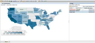
Analyzer has two fundamental reporting controls related to this discussion – Intelligent Map and Pivot Table. To create a geospatial report, I used the “Reseller Sales Amount” measure as the data, the “Geography” hierarchy of the Geography dimension from the AdventureWorks cube, and added the same to the Intelligent Map control. Side-by-side I added a Pivot Table control and added the same entities to it. Effortlessly I created a geospatial report with a lot of built-in features provided out-of-box. The Intelligent Map control consists of a reasonable number of different maps including the world map, which I have used in my report. Many additional maps are available free of charge on the Internet. Strategy Companion has a list of some of the web sites where you can find these maps, which use the Shapefile format (.shp extension) created by ESRI, a well-known GIS company.

The first question that may come to mind is why is the pivot table added to the report, when a map is already there? The Intelligent Map control actually is quite intelligent as we will see through the course of our demo. The first point of intelligence is that, just from the Geography hierarchy, this control has associated all the locations correctly on the map. When you would hover over a particular area, you can see the associated data value in the tool tip. The feature that makes me happy is that it provides an out-of-box drill-down feature. The reason for having the pivot table is that if the user intends to figure out the point of analysis, all information would be required at a glance and the user cannot be expected to hover everywhere. So the pivot table acts as the data coordinates for the geospatial representation of the report.

To take this to the next level, double-click the report to drill down to the next level in the hierarchy of the selected area. The difference in color shows the performance of the area and the same can be measured from the scale shown on the report. Analysts would generally use the very intuitive and visual approach of figuring out the area of interest based on the varying shades of colors (you can also choose to use several different colors such as red, yellow, and green) and then get into the numeric details. The pivot table is also capable of drilling into the data and you can get all the details from there. You may also choose to expose one region’s details on the map while simultaneously showing the details for another region on the pivot table.

Pivot tables (also commonly called grids) are generally used for slicing and dicing of data, and geospatial representation of the data is used for distribution analysis of data over a selected geography. One problem from the above report is that you would not find names represented on some areas, also some areas might be very small from a geography perspective. In the pivot table you would find a long list for State-Province under United States. So how do you associate these two? The answer is “Manually”, as there is no association between these two parts of the report. Ideally after drilling down the geography, data distribution has become large, so geospatial representation is convenient for users to select area to start slicing-dicing. But this needs both types of the report components to work in harmony.

With this comes the challenge of usability, interactivity and intelligence all at the same time. The Intelligent Map control is capable of addressing these challenges. In the below screenshot you can see that this control can be set to support slicing-and-dicing data as the primary objective. Also the scope of actions on this control can be specified, which gives the flexibility to associate the actions performed on this control on different parts of the report.

After configuring this control, check out the report. Drill down on “United States”, and you would find that not only the map has gotten drilled down to the lower level, but the pivot table also works in harmony with the selected geography. I selected “Colorado” and on the grid the same got selected readily. Users do not need to scroll long lists to locate the area which they selected on the map for analysis. With an interactive Intelligent Map and Pivot Table, both capable of drill-down and drill-through features, and capable of working in harmony, users almost have a gadget in the form of a report, to perform slicing-and-dicing driven by geospatial analysis.

From a Microsoft BI products perspective, the ingredients I would need to create this geo-spatial recipe are: SSRS Bing Maps control, Grids (SSRS Tablix / PPS Analytical Grid) with drill-down and drill through enabled and connected using Sharepoint webparts. And still making them work in the same harmony as shown above would not be as effortless as this. Of course, each platform has its own advantages and limitations. To explore what more Analyzer has to offer compared with other reporting tools, you can download an evaluation version of Analyzer from here.

Tuesday, August 02, 2011

SSIS on Cloud with SQL / Windows Azure : Future Applications

I'm reading: SSIS on Cloud with SQL / Windows Azure : Future ApplicationsTweet this !
Generally cloud and ETL have a typically known application of facilitating ETL, which mostly harnesses the elasticity of computing resources. ETL on cloud is ideal for applications where data is already stored on the cloud. Regular line of business applications would process data from OLTP sources and load the data on another data repository on the cloud. For ETL to source and load data from in-premise data sources, WCF and related RIA services are employed. Using Amazon EBS cloud and customized VM images, you can setup your ETL on cloud and Amazon EBS out-of-box supports SSIS standard version. Right when Azure was in it's CTP, I had authored two articles on SQL Azure, on how to read and write data to SQL Azure using SSIS and SSRS 2008 R2. But this is something that is already well-known. What's new ?

Semantic Web, Unstructured Data and technologies that store, process, analyze, warehouse such data and extract intelligence out of the same is the new challenge that is at the horizon of the IT industry. Few front line IT majors have tsunami sized data generated everyday due to the virtue of popularity of social media, and such organizations like Google, Yahoo, Facebook, etc have already started wrestling with these challenges. The benefits of processing unstructured data, and driving your business based on the extracted intelligence are very clear from the example of these companies where they within a duration less than a decade, their advertising revenues are worth billions and still skyrocketing. All standard business house have lots of unstructured data like emails, discussion forums, corporate blogs, recorded chat conversations with clients etc. Organizations generally have aspirations to build a knowledge base for all the different areas of business functions, but when they start seeking consulting on the strategy to implement the same, they find themselves in a whirlpool of processes and financial burdens. Unstructured data has the potential to generate data for such knowledge base.

Still the question in your mind would be, what has this to do with SSIS and Azure? Regular applications of SSIS are known to everyone, and more than that professionals would be knowing that SSIS is not supported on Azure cloud platform, which might be the motivation of reading this post as the subject line reflects that is might be supported now. SSIS is an in-memory processing architecture, and implementing the same of shared / dedicated cloud environments has its own challenges. I am also sure that SSIS Team must be on its way to bring it to the crowds in the time to come. But my interest in on the future application of SSIS on unstructured data, and hosting it on Azure cloud platform.

When SSIS would gain such capability, applications like Extractiv would be common across enterprises. To build application like Extractiv using SSIS, solution design would be too crippled as SSIS is not inherently blended with cloud. One day I would like to see SSIS packages getting executed as a crawler service in Sharepoint, which would crawl entire site and data on Sharepoint portals like FAST Server, extract entities from unstructured data and populate next generation of warehouse on the Azure cloud platform, that would be queried using LINQ for HPC kind of technologies. For me, applications like Extractiv are very fascinating, as they inspire to foresee ideas, that are window to opportunities which most are not able to envision right now.

Sunday, July 31, 2011

Infographics in a BI Solution

I'm reading: Infographics in a BI SolutionTweet this !
These days my interests have been converging a lot on subjects related to extracting BI from unstructured data. Editing a few properties, learning a few functions, developing few queries for faster data access, authoring colorful reports and more tasks like these make many professionals feel so accomplished that they no more feel to broaden their horizons. In my personal opinion, such are good for professionals whose scope are limited to being product practitioners / testers / salesmen / market makers (I mean evangelists). I am sure that those who envision the world of IT, find these limits too short to contain their potential. Enough of thought work, lets get back to business.

Have you ever thought that if you would try to transform unstructured data into semantic data, and intend to report the same data, how would you report it? SSRS Reports are generally used for operational reporting and Dashboards are generally used to performance monitoring and measurement, know as CPM (Corporate Performance Measurement). But for example, when you try to structure data from a source like Wikipedia which is completely unstructured data, create intelligent structures to mine data, and intend to report the same, what would be the ideal way to report the same. In my viewpoint, intelligence extracted out of such data, can be effectively reported using Infographics. If you generally watch some Infographics gallery, you might find some dilbert kind of cartoon symbolizing some meaning. But Infographics are a very powerful way of reporting and gives you the flexibility to report data in a way that no dashboard / visualization can deliver.

Don't believe me ? Below is an example. Study it carefully and you would become a fan of Infographics. Data mined from unstructured data source can very well generate content to extract intelligence reported in the below infographic.

Monday, July 25, 2011

Data Warehousing and Analytics on Unstructured Data / Big Data using Hadoop on Microsoft platform

I'm reading: Data Warehousing and Analytics on Unstructured Data / Big Data using Hadoop on Microsoft platformTweet this !
A major community of data warehousing professionals grow up from the old school of Kimball and Inmon methods of data warehousing. Lots of professionals do boast on virtualization, complex MDX querying, performance tuning OLAP engines and managing data warehouse environments of the size of a few hundred GBs or several TBs, as the most niche and challenging jobs they have on their resume. But there is another world of data warehousing and analytics which most would not have explored, and slowly this revolutionary and emerging wave is reaching SMBs which would effectively challenge the world of data warehousing as we practice today. You might come across a question while reading this post, that what has Microsoft to do with it and answer to this question is towards the end of this post.

Data warehouses and data marts developed using Kimball, Inmon or any hybrid methodology can deal with structured data and have scalability challenges too. Appliance solutions such as Parallel Data Warehouse are Microsoft's candidate to deal with such challenges. Some might think that this is the answer to warehouse largest volume of data and build analytical capabilities on the top of it. But this data volume is just a very small piece of the ecosystem. According to Gartner, enterprise data would grow by 650% in 2014 and 85% of the same would be unstructured data, which is also termed as BIG Data.

Have you ever thought of how organizations like Yahoo, Google, Facebook etc organize their data? Which databases do they use? Whether they have data warehousing and analytics? These organizations have some of the largest data volumes in the world. For example, Facebook is heard to have 12 TB of compressed data added per day and 800 TB of compressed data scanned per day. Can you imagine structuring such volume of data using ETL, storing it in data warehouses, aggregating it using OLAP engines in data marts and extracting analytics out of the same ? To handle such volumes of data for data warehousing and analytics, innovative technologies and infrastructure design are required that can support massively parallel processing, and the one I am talking about is named "Hadoop" which is an open-source distributed computing technology and "Hadoop Distributed File System" which is the storage mechanism for handling unstructured data.

Cloud environments like Amazon are already supporting Hadoop, organizations like Cloudera and IBM are supporting commercial distributions of Hadoop, and a lot of big and famous international business majors are already using Hadoop implementation. The biggest implementation is used by Yahoo with 100,000+ CPUs running on 40,000+ computers running Hadoop. An exhaustive list of organizations using Hadoop can be read from here. Organizations are using Hadoop to implement data warehousing and analytics for purposes like Event Analytics, Click Stream Analytics, Text Analytics and more.

For those who are completely afresh to this part of the world, can go through some very interesting reference material mentioned below:

1) The Google File System

2) Data warehousing and Analytics Infrastructure at Facebook

3) Apache Hadoop Wiki

4) Apache Hadoop MapReduce Implementation at Yahoo

5) Setting up Hadoop on VM

Microsoft is aware of the challenges using unstructured data and Hadoop, and is gearing up slowly for the same.

1) Microsoft Research is developing Project Daytona on Azure platform and Project Dryad, which is perceived by the industry as Microsoft's candidate as an alternative for Apache Hadoop.

2) Those who believe that MDX is the top query language that can deal with huge amount of data from OLAP engines, should check out LINQ to HPC to update their GK.

3) With the increasing popularity and success of Hadoop, Microsoft is also supporting Hadoop on Azure platform. You can get an idea of how to deploy Hadoop cluster on Azure platform from here.

The way Microsoft professionals felt that cloud is something new when Azure was introduced, same would be the case when Microsoft would start supporting Hadoop commercially or introduce a commercial alternative for the same. But neither cloud is a recent invention nor technologies like Hadoop to handle, ware house and analyze unstructred data. In my viewpoint, architects and organizations should develop their readiness to deal with the emerging winds of change and upcoming potential business opportunites that unstructured data can offer.

Monday, July 18, 2011

DQS Cleansing Transform in SSIS - Data profiling and cleansing using SSIS and DQS

I'm reading: DQS Cleansing Transform in SSIS - Data profiling and cleansing using SSIS and DQSTweet this !
Data Quality Services has come up with some interesting concepts.

1) Two main pillars of DQS concepts are - Knowledge Base and Domains.

2) In laymen terms I would consider KB as tables and domains as fields of those tables. Domains have datatypes, constraints, and other attributes just like fields of a table. Domains can also be hooked with reference data providers, to get enumeration of valid and possible values.

3) Composite domains are combination of one or more domains and makes up a complex combination, which is synonymous to calculated fields.

4) When data is passed against these domains, it acts like a regular expression match on the data that is matched against the domain.

5) After the data match against the domain, it applies fuzzy logic kind of algorithm similar to what SSIS Fuzzy Lookup transform. Based on this feature, concepts like "confidence" against the matched value and options to correct the data is offered.

A tool packed with all these features is very useful for data stewards i.e. data quality analysts and operators, and that tool is Data Quality Client. From a higher level if you analyze these points, they all collectively fit in a way to function as a transform. DQS Cleansing Transform in a new transform introduced in SSIS Denali. A very informative article from SSIS Team demonstrating the use of this transform can be read from here. Another great informative article on DQS Cleansing Transform is available from DQS Team, which can be read from here.


Creation of knowledge base and domains is much like creating tables and fields, and if DQS provides an interface to import tables from source systems in the form of KB and domains just like Data Source View, it would make the process very easy and make the tool more friendlier. Honestly, I feel that organizations would have their knowledge embedded in the metadata of database objects. And creating that kind of KB and domains again is not a light weighted exercise. Let's see if such facilitation gets added to DQS in the time to come.

The bright side of DQS is that cleansing becomes more decoupled, powerful, and data profile task and data profile viewer would complement the capabilities of DQS as data profiling and data cleansing are closely associated processes. I would not be surprised if Data Profile Viewer and Data Profile Task gets dissolved into DQS and a new transform called DQS Profiling Transform gets added to SSIS toolbox in Data Flow along with DQS Cleansing Transform !!

Friday, July 15, 2011

MS BI for Time Series Analysis, Deviation Analysis, Regression Analysis, Correlation Analysis and Distribution Analysis

I'm reading: MS BI for Time Series Analysis, Deviation Analysis, Regression Analysis, Correlation Analysis and Distribution AnalysisTweet this !
Few questions are very important to get answered before anyone dives into the sea of business intelligence. You would find many professionals who cannot make out the difference between reporting data and business intelligence. I recently met one senior professional having approx 14 years of experience, and he was not clear of what is a data warehouse. He used to consider anything that stores data in the form of dimension and facts tables is a data warehouse, which is completely incorrect. The biggest drawback of this lack of understanding is that one cannot understand the life-cycle of how an organization gets BI ready.

I define BI readiness in 4 steps : Data Intelligence, Reporting Intelligence, Integration Intelligence, Business Intelligence. You can read more about this in my article titled "
Select a BI software with full knowledge of what it does".

Now say that you understand the importance and concept of gaining organizational data maturity to harvest Business Intelligence. But the next question is that if an organization wants to get BI ready, do they need to open up a new data center or a few servers running on memory steroids? Cloud is a growing trend for infrastructure elasticity, and Microsoft is also gearing up fast on Azure platform. But again the question is, are you ready for Cloud BI?

Migrating or developing BI solutions on the cloud needs an assessment of your existing line of business systems. I have authored another article titled "
5 cloud BI considerations for a successful rollout", which can be read to gain a little deeper insight into this topic.

Finally when your understanding of BI and your infra requirements to host the same are resolved, one another and most important question would hit you - How to recognize / build a true BI software / solution ? Every business has Sales, WorkForce, Products, Business Operations and other Business As Usual constituents. If you have ever studied statistics and statistical methods which are used for analysis by senior business management to analyze different aspects of the business, you would have heard of analytical methods like Time Series Analysis, Deviation Analysis, Regression Analysis, Correlation Analysis, Distribution Analysis and more. These are high level categories of analytical methods and needs a mathematical and scientific approach to analyze and visualize data.

Based on the analytical capabilities of your BI solution, you can assess its BI value. To understand and assess any BI tool you should consider to assess these methods, and to read more about how to analyze any BI tool / software, you can read my article titled "Business Intelligence tools Analyzed" where I have explained four essential analysis features for BI solution. Once you understand what these analysis methods are, you can try to figure out features in MS BI which can help you build these forms of analysis, and then you can derive if MS BI is a powerful BI solution development platform.

Feel free to share your feedback on these articles.

Wednesday, July 13, 2011

Install SQL Server Denali CTP3 - SSDQS and BISM leads the show

I'm reading: Install SQL Server Denali CTP3 - SSDQS and BISM leads the showTweet this !
SQL Server Denali CTP3 and SQL Server 2008 R2 SP1 have been publicly released, and is available for download. You can read about the official announcement from here and the quick link to download Denali CTP3 is here.

Star of the release seem to be SQL Server Data Quality Services and Business Intelligence Semantic Model !! Yes you are reading it right, I didn't say SSAS, I mentioned BISM. There are a lot other new exciting features that shows its glitter right while installation itself. As they say, "A Picture is worth thousand words", and without making you all read too much of instructions, below are a few significant screenshots from my Denali CTP3 installation in my VM.

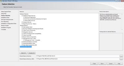
Installation is quite straight-forward, but you would find additional tab pages while installation. In the below screen you can see new features for selection like Data Quality Services, Data Quality Client, Distributed Replay Controller, and Distributed Replay Client.

If you analyze carefully, DQS is classified under Database Engine Services category. This itself gives the first insight into the architecture of DQS. In my understanding, as its contained in the database engine service probably as an object model, you can set up different instances of DQS only by creating different SQL Server instances. Data Quality is closely associated with data, so it makes sense to position DQS more close to DB than classifying it as a shared features. But from a scalability perspective, my immediate train of thought says that it would have been better introduce it as a separate service in itself so that one can create several instances of DQS on different servers, group the same in a cluster and create a Data Quality Control center. But that would require DQS to be an independent and matured service of the likes of SSAS and SSRS with supporting client tools. So I am happy for now having DQS as a feature under Database Engine Services. To complete DQS installation, follow the steps mentioned here.

Thankfully, DQS team has announced DQS Team blog, which would be a driving resource for the community looking forward to DQS. Expect more updates on SSDQS from me very soon.


After a few screens, you would find the glimpse of BISM. You would get options to select Multidimensional mode (OLAP and SSAS) or Tabular Mode (Powerpivot and VertiPaq Engine). This seems the realization of the vision of enabling users to choose OLAP or Tabular data and querying it with MDX or DAX, with any combinations.

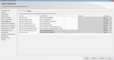
After that you would get few other new pages.


Finally once you have installed entire tools and services, just open BIDS and see the new world that is getting ready at Microsoft to bring new winds of change in MS BI.

Related Posts with Thumbnails