Tuesday, June 28, 2011

Trellis Chart Analysis using Analyzer

I'm reading: Trellis Chart Analysis using AnalyzerTweet this !
The true power of any report authoring platform lies in its ability to let users analyze data effortlessly and visually, involving the least amount of manual calculation. To support such a level of visual analysis, the main ingredient of the reporting platform is visualizations and infographics. In simple terms, a reporting platform should be very rich in charting and graphing capabilities. This does not necessarily mean that graphs need to be available in 3D form, gradient based colors, animation, or other fancy “eye candy” UI, which may look impressive at first glance but not provide additional information to the business user. By rich features, I mean that right kind of graph authoring capabilities required for various kinds of analysis like outlier analysis, correlation analysis, frequency distribution analysis and others such regular form of analysis which should be supported out-of-box by the reporting platform.

In this recipe we would take a look at how to create a typical trellis chart and analyze data in a sophisticated manner. The beauty of this recipe is the ease of authoring this level of complex graph, without any report programming effort or knowledge. I will intentionally not explain a trellis chart right now, as the intention is to understand how the resultant graph helps in a deeper analysis, which in this case would be a trellis chart. Through the course of discussion, you will develop an understanding of how to develop trellis chart compared to a regular chart.

Using the AdventureWorks cube, I have created a very regular column chart, that displays the Reseller Sales Amount measure, for the Year attribute of date dimension sliced by the Country attribute of Geography dimension. As you can see in the below screenshot, many of you will notice that missing data for some years is not represented for some countries.
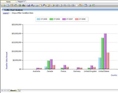


To analyze the graph in a better way, many would want to rotate the axes, and have the Year attribute on the Y-axis and slice by Countries. Ideally, reporting is mostly done on a reporting period like a financial year or calendar year. So after rotating the axis, we would get the below kind of graph. Rotating the axis is as easy as clicking a menu option in Analyzer for the Quick Chart component. After rotating the axis, the chart looks like the below screenshot:
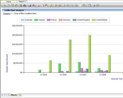

Now comes the real challenge with the analysis part. If you look carefully, the first limitation with the chart is that one does not have data of the same country side by side for analysis. This analysis is done only in the mind of the user. If we rotate axis, we would get data of the same country side by side, but at the cost of not having the reporting period in sequence, which makes the chart further hard to analyze. From the above chart, as the data is of a modest size, this analysis might still be feasible from the chart, but in the case of a larger quantitative analysis, the problem would worsen.

The solution to this problem is to have a pivotal view of data, with the representation of data still in a chart-based format, which is known as trellis chart. Achieving this functionality is just a matter of clicks using Analyzer. You can edit the settings of the chart to display all the series in different charts.
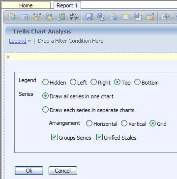

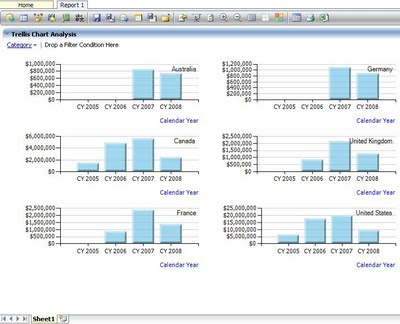
After selecting “Draw each series in separate charts” setting for the chart, the chart would take the shape as shown in the below screenshot.
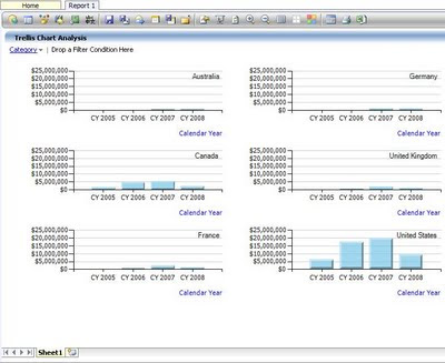

Using this trellis chart representation, you can analyze data for the country individually in each chart for all the reporting periods, as well as compare data of one country with another country for each year or across the entire period just by analyzing the size of the bars, as the scale of each chart is exactly the same.

After this analysis, one might find that some countries performed quite low compared to others, but as the scale is too high, exact value of the reseller sales amount made in each year is not visible. For example, if you look at the chart of Germany you would be hardly able to make out the sales in CY 2007 and CY 2008. This is also a challenge with a regular column chart, that you cannot have individual scales for each countries / reporting periods, as the entire data is clubbed in one chart. But with the trellis chart we should have this flexibility, and as expected, Analyzer provides report authors with this flexibility too. If you edit the settings of the chart, and uncheck “Unified Scales” option as shown in the above screenshot, you would get the chart as shown in the below screenshot, which solves this issue.

With scales adjusted individually for each chart, you can analyze data for each country individually, and when you want to compare data across charts, it’s just a matter of unifying the scales.

Such report authoring would generally take two different reports involving programming efforts with many reporting platforms. But with Analyzer, once you are familiar with the report authoring interface, it’s just a matter of clicks. You can try out the evaluation version of Analyzer, to learn about more such amazing report authoring capabilities.

Sunday, June 26, 2011

Planning visually appealing dashboard using MS BI

I'm reading: Planning visually appealing dashboard using MS BITweet this !
The notion of developing something that is very visually appealing is so much ingrained into the minds of business stakeholders and professionals, that whatever technology that provides fancy, animating, and colorful visuals, they develop an image that its the technology of choice to develop visually appealing dashboards. There are several points to consider, while planning to develop a visually appealing dashboard. Below are few points which are very important to consider when you plan to develop a visually appealing dashboard using MS BI and Sharepoint BI.

1) Visually appealing is a subjective measurement, so the design should be developed keeping the end users in mind. There is a difference between a visually appealing website design and visually appealing dashboard design. Keep in mind that websites might be meant to capture data whereas dashboards always report data.

2) Consider controlling the level of fanciness on your dashboard, as the intention of dashboard is to make the user concentrate on data and facilitate the user to visually and effortlessly analyze data. Too much fanciness like animations, too much colors, etc would take distract users attention from data and might even confuse the user.

3) You might have seen MS BI VPC and got impressed with the visuals of Excel Services, Performancepoint Services and other elements. But do not get carried away but just what you see. Consider studying the inventory of features that these technologies provide and map it against your requirements.

4) Do not base your POCs or analysis based on easy data sources like XML files, Tabular data or Sharepoint lists. Mostly data flows from an OLAP model into dashboards (at least in tactical or strategic flavors).

5) Consider studying the architecture of the technology before selecting it for your visually appealing wonder. You might create a POC and find that data from one spreadsheet displays data well with excel web parts and when you need context-sensitive and user role and privilege specific data, the model might fall apart.

6) In the dashboard parlance, visually appealing would mean analyzing data interactively like drilling, slicing-dicing etc and other form of visually appealing would be data analysis using visualizations and info-graphics.

You do not hire a fashion designer to design the interiors of your home, to make it pleasing to the eyes. In the same way, theory of making a visually appealing website cannot be applied to develop a visually appealing dashboard.

Monday, June 20, 2011

What to use for reporting - .NET or SSRS : Application Development Framework / Report Server ?

I'm reading: What to use for reporting - .NET or SSRS : Application Development Framework / Report Server ?Tweet this !
One quality that has always helped me in my career till date is that when I come across something technical that I do not know / understand, instantly a huge amount of curiosity gets created in my mind. This has been a virtue / trait since the time I was in my academics. Due to this curiosity, our mind generates lots of questions, and this eventually makes us learn a lot as we try to find answer to those questions. With growing maturity and experience in the industry, we start taking many fundamental level things as granted and ignoring things that we do not know or understand. Our cup of mind becomes so full with the acquired knowledge, that we do not agree to empty this cup for a while to draw another cup of knowledge into the bucket of our brain. For example DBAs would want to ignore BI, BI folks would ignore Application Design Patterns, Application folks would ignore databases, still most professionals want to be a Solution Architect !! One thing that I myself struggle after approximately a journey of a decade in the IT industry, is how to sustain myself to continue thinking like a fresher or even a child who is full of curiosity and keep learning more and more everyday. One fresh member in my team asked me this question about reporting, and her curiosity made me author this post.

Though a very simple question, but the rationale behind this can be very interesting and debatable. In my opinion, you firstly need to figure out if you just intend to display data on a screen or you intend to report data. Though it might sound similar, there is a difference. If you just intend to display data, and surrounding it there would be GUI where user can manipulate data, application frameworks like .NET are best suited. And a huge .NET community would already favor using .NET for reporting any data. The main interest would be in why we should NOT use .NET for reporting data ? Though not a complete list, below are a few reasons in my viewpoint for the same:

1) SSRS Charts, Graphs, Gauges is a very unique capability that is not available with almost any other microsoft tools, apart from the ones like Excel. Visualizations are the ideal platform for reporting data, if the intention of reporting is analysis. Does .NET provide equally rich graphing / charting capabilities?

2) Using .NET one would have to hook into SMTP APIs and program to simulate the functionality of subscriptions, which is readily available with SSRS server.

3) From an architecture design perspective, if you want to follow a component model, you decouple report design from application UI as both are two different elements. It the same philosophy with which .NET came with web pages (.aspx) and code-behind files (.vb / .cs) to decouple UI and application logic. In the similar way report logic needs to be hosted and managed in its own layers.

4) SSRS reports introduces a thorough architecture that can be easily integrated and extended. You can collect SSRS reports output and still display in Sharepoint / .NET, and keep your report server sufficiently decoupled.

5) Finally, just give a thought to how would you simulate functionality of snapshots and other kind of reporting available in SSRS? You might be able to re-invent the wheel, but is it really worth the effort?

Wednesday, June 15, 2011

Load balanced BI Solution - Storage and deployment strategy

I'm reading: Load balanced BI Solution - Storage and deployment strategyTweet this !
In a MS BI platform based solution, Sharepoint it mostly used as the deployment platform for web-applications, reports and other artifacts of the solution and it's a very standard practice. But this remains as simple as it sounds only till you have one server per technology / hosting platform, for eg Application Server, Database Server, Report Server, Analytics Server, ETL Server etc.

As soon as you start scaling your solution infrastructure, like load balanced federated server solution, implicitly your solution gets replicated across servers. There are standard practices to keep the codebase synchronized, but the caution area that is not visible implicitly is that Sharepoint itself can act as a data storage medium for a variety of content. In fact Sharepoint is recognized as a Content Management System. You can store SSRS reports, Performancepoint artifacts, Excel Services worksheets, Visio diagrams and much more on sharepoint. If you are not well informed of the internals of how sharepoint stores data, you would end up replicating tons of these artifacts on different servers.

The key piece to this issue is a one piece of information - every sharepoint site has a content database and that database is a SQL Server based database. Application can store data in sharepoint in sharepoints lists and other objects, and BI solution artifacts are also stored on sharepoint sites. When you replicate your sites to different servers in a load balanced environment, all sites should refer to a common content database, and configuration should be done accordingly for all the sites.

This strategy gives a huge benefit, the prime ones being centralized deployment and bullet proof shield against data integrity issues. Anything stored on one site is automatically available on all other sites, avoiding any synchronization between sites replicated on different servers. Also you deploy artifacts on one site, it would get stored in shared content database and effectively the same becomes available on all the replicated sites.

Dimensional Modeling, Cube Design, Dashboard Design, ETL Design, Reports Design etc are popular BI areas, but solution design is the ultimate expectation from an Architect. Professionals can shy away by taking refuge under their strength area like Data Architect, Application Architect, BI Architect, Integration Architect etc, but someone would have to assume role of driving these genius and this class of architect is known as Solution Architect.

Sunday, June 12, 2011

Planning integration of source systems in your data warehousing solution

I'm reading: Planning integration of source systems in your data warehousing solutionTweet this !
Any ETL designer would think of integration with source systems, with ideas like, ETL would connect using X driver, X database, stage to X server, load to X destination etc. But an architect cannot take anything as provided and would have to validate even the basic questions. Some of this basic questions are listed below, and when you start figuring out answers to these questions, you would feel a need to start planning the integration from an infrastructure and integration perspective, even before ETL designers can think of the feasibility of an ETL solution.

1) Where are the source systems hosted, on a physical cluster or a VMWare based server in a virtualization environment ? Are load balancers placed on these servers ? You would require to collect Virtual IPs to connect to those servers and keep in mind how your ETL solution would read data from these servers.

2) What is the classification of data in source systems and is this in sync with the zone in which your ETL server is hosted ? Generally in any data center based hosting or enterprise class IT environments, source systems / data is classified as RESTRICTED / UNRESTRICTED / CONFIDENTIAL etc, and different data traversing policies revolve around this classification. Data can generally be exchanged only within systems in the same zone of data classification.

3) Is your connectivity uni-directional or bi-directional ? Many systems just allow uni-directional connectivity from other applications to the database server. So database server might be able to connect to other system, but other systems would not be able to connect back to the DB server i.e. connectivity can be initiated only from DB server and network policy itself would impose this restriction.

4) What is the type of connectivity allowed with the source system database server - Windows integrated or SQL based ? Mostly enterprise class IT environments allow only windows integrated connectivity, as policies can be enforced on windows id.

5) Where is your scheduling server located ? Generally application specific scheduling agents are not allowed in any enterprise class IT environment. You need to locate your scheduling batch server, and check whether you would be able to trigger execution from that server, or you would need an agent installed on your DB server and trigger execution from DB server. If your ETL execution is triggered from a scheduling batch server, connectivity needs to be available to source and destination servers from the batch server. And if execution is going to be triggered from your DB server, connectivity to source system should be available from this server.

Unless and until your solution environment has no governing policies, and you have complete discretion and governance over source and destination systems, and your solution is just hosted on application specific servers and not in any data center based hosting environments, you need to plan your integration at a much deeper level. I hope the above points would provide a few hints in this direction.

Monday, June 06, 2011

Custom Visualizations in SSRS for quantitative data analysis

I'm reading: Custom Visualizations in SSRS for quantitative data analysisTweet this !
Representing a dataset having hundreds of data points on a single report is not an easy job. If report is displayed in tabular or matrix format, generally the approach followed is pagination or filters. But consider that if neither of it is an option, when the requirement is to comparatively analyze all these data points, grid based data representation is out of question.

The first step to achieve quantitative / statistical data analysis is by using effective visualizations. Certain examples of these visualizations are Tree Maps, Lattice Charts, Correlation matrix, Table Lens etc. These visualizations might not be available out-of-box, but by embedding graphs / charts inside a matrix, such visualizations can be created very easily.

A data set would be having lots of data points in one or more fields, and those fields would be having many axis. For example, a dataset having sales of every month over the past five years. If you try to display the same on a graph, it would be almost impossible to represent 60 data points on the same graph grouped by different years, as this would look very messy. The solution in such scenarios is to create a graph having data for one quarter of a year, and then create a matrix of such graphs. So your result would have four small sized graphs for 4 quarters (i.e. 4 columns) x 5 years (i.e. 5 rows) = 20 small graphs. If you are using a bar graph as your base graph, the visualization that would get created would be called bar plot / trellis graphs. Other examples of such plots are scatter plot matrix, histogram plot matrix etc.

Below sample visualization is an example of how you can display quantitative data i.e. huge volume of data points on the same visualization and make the data comparable as well as analyzable. You might not believe but the below visualization contains thousands of data points plotted on it, and still this data is analyzable for its intended purpose.


Friday, June 03, 2011

Master Data Management and Data Quality Ebook - Download FREE

I'm reading: Master Data Management and Data Quality Ebook - Download FREETweet this !
Data Quality and Master Data Management are a common and very huge exercises in terms of implementation within any organization.

Any enterprise would have a collection of applications for its various business and internal operations. Every application cannot be expected to be designed or readily available, such that is standardizes each piece of information. At some level, free form textual input would be made available for business needs. This is the first point where data quality issues makes its first step. Lack of standardization and integration between different applications for capturing information that is common across applications leads to inconsistent data, which is another point that stimulates data quality issues. Profiling data to identify the areas of your data repositories that are lack data quality, and devising the cleansing policy to rectify data quality issues is collectively known as data cleansing process. Fuzzy lookup transform, Data Profile Viewer and task are SSIS gadgets in SQL Server 2008 R2 that can aid in dealing with data quality issues.

Master Data Management is a very very sensitive exercise and need extensive domain knowledge and research in the business for which its intended, and there are full fledged software suites just for this purpose. This activity is a common exercise in any systems integration programme. Even when you are accumulating information from various sources for your ETL loads, you would need to maintain a temporary / permanent staging environment to manage common master data from these source systems, before you start processing transactional data. Though this master data management is functionally different from MDM carried out during a system integration programme, but technically more or less they are similar exercises. Master Data Services is the SQL Server offering which is in very initial stages (in my personal viewpoint) to help users deal with MDM exercise upto an extent.

A new free ebook is available from Solid Quality Mentors, which describes the above mentioned content, and the ways to implement it using SQL Server 2008 R2 tools. This book can be downloaded from here. I wish that this book should have come a little late, then it might have covered SQL Server Data Quality Services which is the upcoming offering in the Data Quality area from SQL Server Denali.

Wednesday, June 01, 2011

Harvest continued ROI and add value to your SSRS reporting investment with Analyzer

I'm reading: Harvest continued ROI and add value to your SSRS reporting investment with AnalyzerTweet this !
SQL Server Reporting Services (SSRS) is the built-in reporting backbone in the Microsoft BI stack. Customers who have based their reporting solutions using MS BI would have invested in terms of hardware and licensing to build up their report servers. Generally, report servers are categorized as shared services in an enterprise-class IT environment. So the servers are setup in a load-balanced environment, where different report server nodes are built and managed through a load balancer. Reports are hosted in these environments, and support teams maintain these load-balanced SSRS servers to meet application reporting requirements.

SSRS is a great reporting platform, but it caters to the purpose for which it is designed, and like every other product it has its set of limitations. Some of the major ones are:

1) Limited application programming interface to customize the user interface. SSRS Report Viewer Web part and SSRS Report Viewer Control are two of the most prominently used controls that act as an application interface to SSRS Server. And none of these controls can be programmed in terms of UI.

2) SSRS is a reporting platform and/or technology, but it’s not a collaboration platform. Reports Manager acts as an operation console for users to access and administer SSRS reports, but it offers too little in terms of personalization and collaboration.

3) Mobile business intelligence is almost completely absent with SSRS.

By the time an organization starts feeling the pressure of these requirements, you would have already made your reporting investments. No organization would like to scrap their existing investments and head on to a new reporting platform for obvious reasons. These investments can be in terms of development efforts, licenses, infrastructure and more. So the need is to have a reporting platform that can integrate with SSRS and add value to it as well as sustain ROI from the investments already made.

Now the question arises, how does Analyzer qualify to be considered as one of the suitable candidates for this scenario?

1) Analyzer has recently come out with a rich Mobile BI offering, and this is one of the biggest value additions to your reporting platform. You can read more on this from my
previous article on Analyzer.


2) Analyzer is a zero-footprint installation, which means that your reporting platform customers do not need any additional infrastructure or setup for accessing Analyzer.It can be used as a Web Front End to SSRS reports, replacing Reports Manager as it offers a lot of collaboration and personalization features too. Using Analyzer, an organization can have the best of both worlds, i.e. Operational SSRS report and Analytical Analyzer Reports authored using Analyzer. I would reserve an in-depth discussion on this for another article.


3) The main interest would be how Analyzer can integrate with your existing SSRS servers, and would the users have to get trained with a new Analyzer API to hook into an SSRS server to access reports?

The answer is that nothing changes in the way you connect to your report servers and access reports. The below two screenshots show how you can use the same familiar interface to connect to your SSRS Server and same familiar Report Viewer control interface to point to your SSRS reports.


In this way, organizations can leverage existing report investments, and add value to their reporting platform by using Analyzer. For more details, you can visit the
product website.
Related Posts with Thumbnails