Reports can be classified in two types from a higher level: Operational and Analytical. These two types of reports differ in the ways they represent information and the purposes they serve. Before we start with the Analyzer recipe that we would discuss in this article, let's try to understand the gap that exists between operational and analytical reports and then we will discuss how Analyzer can help to bridge this gap with minimal effort.
Business decisions are basically long-term, short-term or day-to-day in terms of scope. Operational reports are mostly used to cater to day-to-day operations. Considering this scope, the amount of data in an operational report is detailed. It is easy to get carried away with the assumption that operational reports have data from OLTP systems and the scope of data in terms of time scale is daily, weekly or of similar duration. But in my opinion this is a myth, and I am sure that if you ask seasoned reporting practitioners, they would agree with me. The way data is represented on a report mostly determines the utilization value of a report as an operational report / analytical report.
Generally for an analytical report, cubes are used as a data source and the report is mostly represented as a dashboard. One common issue that most poorly designed dashboards suffer is presenting too much information on the dashboard with highly detailed gauges. If a report can't serve the very purpose of an analytical report, which is to represent data in a way that requires minimum manual analysis of the details, while still providing a great amount of analytical value, even if it sources data from a cube it would be used as an operational report and not an analytical report.
Now the question comes up about how to bridge the gap between an operational report and analytical report? The answer for the same is appropriate data representation. Let's try to create an example using Analyzer, where we would try to give an analytical flavor to a report that looks operational, and sources data from a cube.
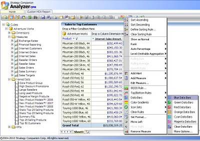
As you see in the below screenshot, I have created a basic report showing "Internet Sales Amount" and "Reseller Sales Amount" for a few top selling products. For this report the data is sourced from the Adventure Works cube in a Pivot Table. In order to compare the sales value for different products in each field, one needs to manually analyze the weight. A weight representation of each value in its respective field would make the report easier to analyze. In the below screenshot, you can see that Analyzer provides out-of-box capabilities to add colored data bars. One thing to note is that such features are not available out-of-box in SSRS, and only in Excel services.

In this report we have added just two ready measures that are available in the cube. But many a time reporting requirements can arise, where we need calculated measures. It can be the case that data warehouses and data marts are governed by other teams, and one might not have the liberty to create these calculated measures in cubes. Also, creating such calculated measures would require a separate development as well as process cycle altogether. OLAP development teams are composed of skilled MDX developers who can develop MDX on-the-fly, whereas report developers are mostly novice in this area. In our example, say we need a simple calculated measure which calculates Internet Sales + Reseller Sales. Fortunately, Analyzer provides a very advanced level though easy to use, MDX building and editing interface.
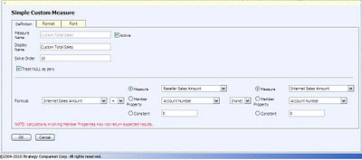
The screenshot that you see below has been activated by right-clicking on the field and selecting "Manage Measures". Here in this screenshot I have defined a calculated measure named "Custom Total Sales", where the formula is to add "Internet Sales Amount" to "Reseller Sales Amount".

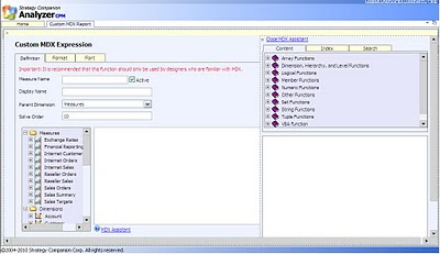
In case you have MDX skills at your disposal and you feel the need to define more complex MDX, Analyzer provides a full-fledged interface to define the MDX of your choice, as shown in the below screenshot. Also you get a help system known as "MDX Assistant” that helps you with different examples for almost all of the MDX programming constructs. This is a very valuable resource, as you do not need to sit with a book by your side or google around, when you are developing or experimenting with a language as complex as MDX.

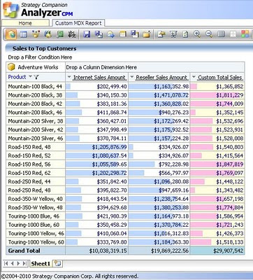
Finally when our custom measure is added to the report, add the colored data bars to all three fields. I have added a blue data bar to both built-in measures, and pink data bar to our custom measure. Just take a look at the below screenshot, and I leave the rest to the imagination of the reader, on how quickly what can be analyzed from this report. We can add lot more details, gauges, indicators, KPIs and other elements to this report. But the intention is not to create a full-fledged dashboard, the intention is to make the report quickly analyzable without trimming the details that an operational report generally contains.

If you want to check out more such features and options that Analyzer provides out-of-box to enrich a plain table report to a report that looks pre-analyzed, try downloading an evaluation version of Analyzer from here. Also try to give a thought on what efforts would be required to develop the report in the above screenshot from the report we had in the first screenshot, using SSRS.


 Article


No comments:
Post a Comment