Showing posts with label Analyzer Recipes. Show all posts

Wednesday, December 21, 2011

Intelligent Reporting on fluid data sources using Analyzer

I'm reading: Intelligent Reporting on fluid data sources using AnalyzerTweet this !

Microsoft Excel is one of the most widely used tools for a variety of business purposes, due to its simplicity, calculation abilities and efficiency as a client tool for accounting purposes. Excel is the tool of choice for not only business users, but for a wide variety of users, right from field engineers collecting data from at the ground level to power-users validating and accounting for this data. Excel worksheets loaded with thousands of records are a huge source of data. But Excel is not meant to be a database management system or a reporting platform either.

Traditional data warehousing methodologies involve developing relational warehouses that are populated from sources using an ETL process – Extract, Transform, and Load. Data from these relational warehouses are processed and stored in analytical databases, which host cube and other data structures. SQL Server 2012 introduces tabular mode Analysis Services and the new Business Intelligence Semantic Model to deal with this scenario. This model requires usage of a new query language known as DAX (Data Analysis eXpressions). As it is a complex process to transform relational data into a dimensional model to facilitate robust analytical capabilities, business users often have to accept tradeoffs and constraints on their ability to perform analytical reporting. These tradeoffs are due to the limitations associated with provisioning data in analytical form. In this Analyzer recipe, we will take a look at what features Analyzer has to deal with this challenge.

The latest version of Analyzer introduces a new feature known as Data Packages to deal with the scenario discussed above. This feature provides the user with the ability to upload their data in Excel / Access file formats. After upload, options are provided to create a model for reporting, and the same model is created as an analytical model for intelligent reporting. Consider you have products-related data from Adventureworks in a flattened Excel file, having 60K records and a lot of fields. After the file is uploaded, all the attributes are listed as shown in the below screenshot. All the attributes are grouped in a single dimension by default. Dimensional modeling requires every unique entry to be associated with a key attribute. This is taken care of by an option to generate a unique key.


The Attributes tab facilitates selection of attributes for the dimension, and the Measures tab allows selection of measures. All numeric fields are identified by default as measures. Time is one of the most important dimensions in any dimensional model. Fields having date / time are identified to be configured as the key for a time dimension. Once the model is configured, it can be saved for later processing or can be processed in place. After processing, Analyzer creates a dimensional model and deploys the solution to the SSAS instance configured to be used with Analyzer. Apart from attribute selection, the entire process of deployment is entirely transparent to the end-users.

One important point that comes to any seasoned SSAS practitioner’s mind is how users would browse attributes. For example, Category -> SubCategory -> Products is a logical and natural hierarchy. Two questions that arise are 1) How would the users know whether a hierarchy exists? 2) How to build this hierarchy? When the model created from the uploaded files is deployed to SSAS, a dedicated database is created for it. If the database is opened using BIDS, it can be easily edited to enrich the model and build a hierarchy. The best part of the entire Data Packages solution is that the model is deployed as a normal SSAS solution and no proprietary encrypted code is injected, as seen in the below screenshot. This allows you to use BIDS with the Data Packages feature, should you wish to enhance an Analyzer-generated cube. Creating such a hierarchy would give a clear visual clue to the user of how to interpret and use the data, but creating the hierarchy would typically require intervention from the IT department as an end-user cannot be expected to accomplish this.


Even if the end-user does not have that support from their IT department handy, it is not a show stopper. Users might not get the visual clue of a hierarchy, but if users are well informed of the data they intend to analyze (which they should be) then Analyzer works on the intersection of fields and provides the same data browsing and reporting experience with/without a hierarchy in place.

The below screenshot displays the hierarchy of products on the rows axis, and it has Country->City on the columns axis. Without even creating a SSAS hierarchy, based on the association of data, Analyzer detects the relationship and displays data in the same way. From a fluid data source like Excel, which has fluid data types and virtually no metadata, Analyzer creates an analytical model transparently. Once the model is available, users can benefit from the intelligent reporting capabilities of Analyzer, without the time and resource-consuming hassle of the IT-supported provisioning process.


Without even a BISM, Analyzer has its own version of a BISM that works transparently for end users and equips them with analytical models on the fly for intelligent reporting capabilities. One of the main differences between the two is that the Analyzer “BISM” works with any version of Excel and does not require SharePoint or SQL Server 2008 R2 or SQL Server 2012. To find out more about this exciting and unique new feature, download an evaluation version of Analyzer.

Wednesday, October 19, 2011

Operational Data Analytics using Analyzer

I'm reading: Operational Data Analytics using AnalyzerTweet this !
Any quantitative data analysis would mean that there are a huge number of data points to analyze using visualizations and derive meaningful readings from this sea of data. A major part of the reporting world is composed of analysis of operational data, compared to analytical data. Reporting and analytics solutions are not meant just for the most elite management audience, instead operational reporting and analytics is one of the biggest areas where analytics can help to improve business processes. At this level of data analysis, generally the reporting constituency is formed of very simple visualizations for data representation, for example simple charts and graphs, grids, etc., and the target audience cannot be expected to be skilled enough to use advanced visualizations using sophisticated statistical formulas for their derivation. But that does not mean that there is no need for any advanced reporting solution in this area, as the reporting requirements are pretty basic.

In this Analyzer Recipe we will take a look at how an intelligent reporting solution can bring that difference to operational data analytics with simple though effective sophistication. For the purpose of discussion, we will take as an example Line Chart Analysis. Line Charts typically draw a graph connecting a series of continuous data points. In the below screenshot, you can see a simple report I have created using a simple line graph and pivot grid. The chart contains a reasonable number of data points for reseller sales amount. The same data is also represented in the grid for a detailed view. The immediate question that should come to the mind of regular users of such reports is, what more can be improved in such reports? We will look at that now.


Many would not know that a more sophisticated form of line chart is the spline chart. Say your capture systems have acquired limited and non-continuous operational data, and you intend to create an intelligent trend out of your limited data. The spline chart is an intelligent option that would fit a curve through your data. With just a simple change in the graph type, the report would look like the below screenshot. If you compare the graphs in the above and below screenshots, you would find that the increase and decrease in the data is shown much more minutely in the spline graph compared to the line graph. You can use the grid to confirm this. For a better experience, try both graphs with non-continuous data, and in that case line graph would not give you a continuous curve, whereas the spline would provide a smooth graph out of your non-continuous data.


Analyzer charts provide interesting and advanced options for line charts (as one example of many chart types available) as shown in the below screenshot. So users who excel in sophisticated operational data analysis, can bring in the required scientific analysis using the below options, without the need to migrate from their regular graphs that might be used by a broad category of operational data analysts. In this way the more basic needs of the general user are taken care of, while at the same time enabling the “power users” to do their own advanced analysis and reporting, using the very same tool.


By changing the chart type to Step Line Chart, which is a more sophisticated form of a line chart, and including a trend line for linear moving average using the options shown in the above screenshot, an interesting trend can be created out of the operational data which is not that clearly visible in the above two types of line charts. With the moving average reference, analysts can always see whether the trend is constant compared to the moving average, which would not be that clear in the absence of this reference line.


In my views, the real power of a reporting solution lies in the ease and effectiveness with which it can make that data visible to the users that is not instantly visible to the human eye. Also, when users do not need to train themselves (or worse yet, go to a training class) to use sophisticated visualizations, and they can continue with their regular tools of the trade which provide an acceptable level of “polishing”, users will be able to adopt and use the reports and reporting solution with the impression that it’s their regular analysis tool with a flavor of modernization in it.

We saw how a line chart can be easily converted to a spline chart for analysis of limited data and better curve fitting purposes, and how this can be converted to a step line chart for better trend analysis with advanced scientific options. Analyzer has many more other such chart types and options, and you can visit the Analyzer web site to explore them more.

Wednesday, September 07, 2011

Intelligent Distribution Analysis using Analyzer

I'm reading: Intelligent Distribution Analysis using AnalyzerTweet this !
Business intelligence reporting tools should be capable of analyzing massive amounts of quantitative data via categorization into distributed frequencies and groups. The intelligence expected here is facilitating analysis of data density distribution across various logically-related or unrelated groups, identifying outliers, quality control, identifying non-linear relationships between different business parameters, and beyond. This corresponds to a branch of statistical analysis known as distribution analysis.

For example, business assignments that are tracked using various project management metrics have cost performance index (CPI) and schedule performance index (SPI) as two of the tracked metrics. A large organization could have several hundred projects running simultaneously. To analyze how the business is performing on cost against schedule, data of all projects is categorized into clusters based on CPI versus SPI, and analysis can be done on clusters to derive the relationship between these parameters as well as performance of projects under different clusters.

Any intelligent distribution analysis starts with the study of higher level composition. In this Analyzer recipe, we would take a look at how a capable reporting tool can help with an interesting and intelligent distribution analysis, and extract insights.


The above screenshot is a typical example of time series analysis using the Adventureworks cube. Sales performance of different geographies is shown. Next logical step for analysis would be studying the distribution of geography in a particular year, and for this, the above graph is not suitable. The first step to study distribution is to merge all individual values in a single entity, i.e. the different bars in any particular year would stand as individual entities. A simple way to merge it into a single entity is by using a stacked bar chart. A stacked column chart would have vertical bars, and if you look carefully, the screen space you would have vertically is much less compared to horizontal screen space. Just with a simple selection, you can change the graph you need for the same data, and the visualization would look like the below screenshot. In case you wish to study only selected geographies, you always have the option to filter out legend and categories.


Pie-charts are widely used for distribution analysis. As we have time-series involved here, we would need a pie-chart for every year. This is as easy as selecting pie-chart graph, but each one points to the distribution of a specific entity for that year, so it should not really be compared across the entire time-series. For example, in the below screenshot, you should not compare the weight of the United States across each year, as the distribution is shown for a specific year. You might feel that CY 2001 has the highest weight of US across all years, but this is not correct. CY 2003 has the highest value and you can see the value when you hover on any pie of the chart. Cross series distribution analysis cannot be done, but you can derive clearly that every time the US had the highest weight age compared to others, which is not that clearly visible when you use a column chart. Keep in mind while considering is distribution analysis is that composition should be studied within the same entity and not across entities.


Senior business management typically uses pyramids to study the composition of different entities, for example a resource pyramid for any particular project. With the selection of a pyramid chart, you can easily achieve the same visualization too. You might be surprised at why all countries are listed in the same hierarchy in all the pyramids, as the performance of each country is varying in each year. The reason is that the Country attribute-hierarchy in the Geography user-hierarchy of the Adventureworks cube is sorted by name. Since Analyzer uses AMO behind the scenes, it will retrieve data in the same order. This works to the benefit of the user. If the sort order of the hierarchy is based on reseller sales amount, the order of the pyramid would also change, which is very much desirable as the flexibility of configuration is left to the discretion of the user. Analyzer also has built-in capabilities to define your own MDX queries, without very detailed knowledge of MDX.


Intelligence in any form of analysis sits in the brain of the individual analyzing the data. With Analyzer one can leave a reasonable level of onus of representing data intelligently on the tool itself, to analyze data using intelligent and interactive visualization suited for different forms of analysis. The above examples of distribution analysis are just of higher level data, but there are more charts options for quantitative distribution analysis using charts like scatter charts and more. You can find out about more such interesting options from the Analyzer website.

Wednesday, August 03, 2011

Geospatial Reporting and Analytics using Analyzer

I'm reading: Geospatial Reporting and Analytics using AnalyzerTweet this !
Data representation has many forms. The intended method and purpose of analysis as well as the nature of the data will determine which form of data representation is most appropriate. With the growing need for better analytics, reports today are increasingly expected to be interactive enough to facilitate analysis.

When it comes to geospatial reporting, the first challenge is to associate two entities together – Data and Geography. Geography is usually represented on a map, and associating data to a map requires a geographical element in your data to associate the two entities with each other. Reporting geospatial data is not something new, but reporting it intelligently requires some reasonable effort, and in this Analyzer recipe, we would take a look at what is the difference between reporting geospatial data and reporting the same in an intelligent manner.

Analyzer has two fundamental reporting controls related to this discussion – Intelligent Map and Pivot Table. To create a geospatial report, I used the “Reseller Sales Amount” measure as the data, the “Geography” hierarchy of the Geography dimension from the AdventureWorks cube, and added the same to the Intelligent Map control. Side-by-side I added a Pivot Table control and added the same entities to it. Effortlessly I created a geospatial report with a lot of built-in features provided out-of-box. The Intelligent Map control consists of a reasonable number of different maps including the world map, which I have used in my report. Many additional maps are available free of charge on the Internet. Strategy Companion has a list of some of the web sites where you can find these maps, which use the Shapefile format (.shp extension) created by ESRI, a well-known GIS company.

The first question that may come to mind is why is the pivot table added to the report, when a map is already there? The Intelligent Map control actually is quite intelligent as we will see through the course of our demo. The first point of intelligence is that, just from the Geography hierarchy, this control has associated all the locations correctly on the map. When you would hover over a particular area, you can see the associated data value in the tool tip. The feature that makes me happy is that it provides an out-of-box drill-down feature. The reason for having the pivot table is that if the user intends to figure out the point of analysis, all information would be required at a glance and the user cannot be expected to hover everywhere. So the pivot table acts as the data coordinates for the geospatial representation of the report.

To take this to the next level, double-click the report to drill down to the next level in the hierarchy of the selected area. The difference in color shows the performance of the area and the same can be measured from the scale shown on the report. Analysts would generally use the very intuitive and visual approach of figuring out the area of interest based on the varying shades of colors (you can also choose to use several different colors such as red, yellow, and green) and then get into the numeric details. The pivot table is also capable of drilling into the data and you can get all the details from there. You may also choose to expose one region’s details on the map while simultaneously showing the details for another region on the pivot table.

Pivot tables (also commonly called grids) are generally used for slicing and dicing of data, and geospatial representation of the data is used for distribution analysis of data over a selected geography. One problem from the above report is that you would not find names represented on some areas, also some areas might be very small from a geography perspective. In the pivot table you would find a long list for State-Province under United States. So how do you associate these two? The answer is “Manually”, as there is no association between these two parts of the report. Ideally after drilling down the geography, data distribution has become large, so geospatial representation is convenient for users to select area to start slicing-dicing. But this needs both types of the report components to work in harmony.

With this comes the challenge of usability, interactivity and intelligence all at the same time. The Intelligent Map control is capable of addressing these challenges. In the below screenshot you can see that this control can be set to support slicing-and-dicing data as the primary objective. Also the scope of actions on this control can be specified, which gives the flexibility to associate the actions performed on this control on different parts of the report.

After configuring this control, check out the report. Drill down on “United States”, and you would find that not only the map has gotten drilled down to the lower level, but the pivot table also works in harmony with the selected geography. I selected “Colorado” and on the grid the same got selected readily. Users do not need to scroll long lists to locate the area which they selected on the map for analysis. With an interactive Intelligent Map and Pivot Table, both capable of drill-down and drill-through features, and capable of working in harmony, users almost have a gadget in the form of a report, to perform slicing-and-dicing driven by geospatial analysis.

From a Microsoft BI products perspective, the ingredients I would need to create this geo-spatial recipe are: SSRS Bing Maps control, Grids (SSRS Tablix / PPS Analytical Grid) with drill-down and drill through enabled and connected using Sharepoint webparts. And still making them work in the same harmony as shown above would not be as effortless as this. Of course, each platform has its own advantages and limitations. To explore what more Analyzer has to offer compared with other reporting tools, you can download an evaluation version of Analyzer from here.

Tuesday, June 28, 2011

Trellis Chart Analysis using Analyzer

I'm reading: Trellis Chart Analysis using AnalyzerTweet this !
The true power of any report authoring platform lies in its ability to let users analyze data effortlessly and visually, involving the least amount of manual calculation. To support such a level of visual analysis, the main ingredient of the reporting platform is visualizations and infographics. In simple terms, a reporting platform should be very rich in charting and graphing capabilities. This does not necessarily mean that graphs need to be available in 3D form, gradient based colors, animation, or other fancy “eye candy” UI, which may look impressive at first glance but not provide additional information to the business user. By rich features, I mean that right kind of graph authoring capabilities required for various kinds of analysis like outlier analysis, correlation analysis, frequency distribution analysis and others such regular form of analysis which should be supported out-of-box by the reporting platform.

In this recipe we would take a look at how to create a typical trellis chart and analyze data in a sophisticated manner. The beauty of this recipe is the ease of authoring this level of complex graph, without any report programming effort or knowledge. I will intentionally not explain a trellis chart right now, as the intention is to understand how the resultant graph helps in a deeper analysis, which in this case would be a trellis chart. Through the course of discussion, you will develop an understanding of how to develop trellis chart compared to a regular chart.

Using the AdventureWorks cube, I have created a very regular column chart, that displays the Reseller Sales Amount measure, for the Year attribute of date dimension sliced by the Country attribute of Geography dimension. As you can see in the below screenshot, many of you will notice that missing data for some years is not represented for some countries.


To analyze the graph in a better way, many would want to rotate the axes, and have the Year attribute on the Y-axis and slice by Countries. Ideally, reporting is mostly done on a reporting period like a financial year or calendar year. So after rotating the axis, we would get the below kind of graph. Rotating the axis is as easy as clicking a menu option in Analyzer for the Quick Chart component. After rotating the axis, the chart looks like the below screenshot:


Now comes the real challenge with the analysis part. If you look carefully, the first limitation with the chart is that one does not have data of the same country side by side for analysis. This analysis is done only in the mind of the user. If we rotate axis, we would get data of the same country side by side, but at the cost of not having the reporting period in sequence, which makes the chart further hard to analyze. From the above chart, as the data is of a modest size, this analysis might still be feasible from the chart, but in the case of a larger quantitative analysis, the problem would worsen.

The solution to this problem is to have a pivotal view of data, with the representation of data still in a chart-based format, which is known as trellis chart. Achieving this functionality is just a matter of clicks using Analyzer. You can edit the settings of the chart to display all the series in different charts.


After selecting “Draw each series in separate charts” setting for the chart, the chart would take the shape as shown in the below screenshot.


Using this trellis chart representation, you can analyze data for the country individually in each chart for all the reporting periods, as well as compare data of one country with another country for each year or across the entire period just by analyzing the size of the bars, as the scale of each chart is exactly the same.

After this analysis, one might find that some countries performed quite low compared to others, but as the scale is too high, exact value of the reseller sales amount made in each year is not visible. For example, if you look at the chart of Germany you would be hardly able to make out the sales in CY 2007 and CY 2008. This is also a challenge with a regular column chart, that you cannot have individual scales for each countries / reporting periods, as the entire data is clubbed in one chart. But with the trellis chart we should have this flexibility, and as expected, Analyzer provides report authors with this flexibility too. If you edit the settings of the chart, and uncheck “Unified Scales” option as shown in the above screenshot, you would get the chart as shown in the below screenshot, which solves this issue.


With scales adjusted individually for each chart, you can analyze data for each country individually, and when you want to compare data across charts, it’s just a matter of unifying the scales.

Such report authoring would generally take two different reports involving programming efforts with many reporting platforms. But with Analyzer, once you are familiar with the report authoring interface, it’s just a matter of clicks. You can try out the evaluation version of Analyzer, to learn about more such amazing report authoring capabilities.

Wednesday, June 01, 2011

Harvest continued ROI and add value to your SSRS reporting investment with Analyzer

I'm reading: Harvest continued ROI and add value to your SSRS reporting investment with AnalyzerTweet this !
SQL Server Reporting Services (SSRS) is the built-in reporting backbone in the Microsoft BI stack. Customers who have based their reporting solutions using MS BI would have invested in terms of hardware and licensing to build up their report servers. Generally, report servers are categorized as shared services in an enterprise-class IT environment. So the servers are setup in a load-balanced environment, where different report server nodes are built and managed through a load balancer. Reports are hosted in these environments, and support teams maintain these load-balanced SSRS servers to meet application reporting requirements.

SSRS is a great reporting platform, but it caters to the purpose for which it is designed, and like every other product it has its set of limitations. Some of the major ones are:

1) Limited application programming interface to customize the user interface. SSRS Report Viewer Web part and SSRS Report Viewer Control are two of the most prominently used controls that act as an application interface to SSRS Server. And none of these controls can be programmed in terms of UI.

2) SSRS is a reporting platform and/or technology, but it’s not a collaboration platform. Reports Manager acts as an operation console for users to access and administer SSRS reports, but it offers too little in terms of personalization and collaboration.

3) Mobile business intelligence is almost completely absent with SSRS.

By the time an organization starts feeling the pressure of these requirements, you would have already made your reporting investments. No organization would like to scrap their existing investments and head on to a new reporting platform for obvious reasons. These investments can be in terms of development efforts, licenses, infrastructure and more. So the need is to have a reporting platform that can integrate with SSRS and add value to it as well as sustain ROI from the investments already made.

Now the question arises, how does Analyzer qualify to be considered as one of the suitable candidates for this scenario?

1) Analyzer has recently come out with a rich Mobile BI offering, and this is one of the biggest value additions to your reporting platform. You can read more on this from my
previous article on Analyzer.


2) Analyzer is a zero-footprint installation, which means that your reporting platform customers do not need any additional infrastructure or setup for accessing Analyzer.It can be used as a Web Front End to SSRS reports, replacing Reports Manager as it offers a lot of collaboration and personalization features too. Using Analyzer, an organization can have the best of both worlds, i.e. Operational SSRS report and Analytical Analyzer Reports authored using Analyzer. I would reserve an in-depth discussion on this for another article.


3) The main interest would be how Analyzer can integrate with your existing SSRS servers, and would the users have to get trained with a new Analyzer API to hook into an SSRS server to access reports?

The answer is that nothing changes in the way you connect to your report servers and access reports. The below two screenshots show how you can use the same familiar interface to connect to your SSRS Server and same familiar Report Viewer control interface to point to your SSRS reports.


In this way, organizations can leverage existing report investments, and add value to their reporting platform by using Analyzer. For more details, you can visit the
product website.

Friday, May 06, 2011

Developing and provisioning Mobile Business Intelligence using Analyzer

I'm reading: Developing and provisioning Mobile Business Intelligence using AnalyzerTweet this !
Mobile business intelligence is a very loosely-defined term, but without a doubt it’s a much-desired feature for almost any kind of reporting audience. With the advent of more and more smart devices, access to the web is not limited to desktops and laptops anymore. You would find devices like smartphones, tablet PCs, IPhones, IPads or at least GPRS-enabled cellphones with almost every second or third user who regularly uses Internet or IT-enabled systems. Generally, specialized accelerators are used to modulate your regular reports to suit the navigation and display capabilities of a smart device. But the consideration linked with such accelerators is that you need separate accelerators for separate devices as these accelerators are mostly device-specific and add an additional processing interface to deliver your reports on the target devices. If your reporting model changes, your accelerator might also be subject to change. Ideally the reporting solution should have built-in intelligent capabilities to make the reports suited to the device on which it is being viewed. Maintaining multiple definitions of the same report for different individuals or groups of devices makes the reporting solution very hard to develop as well as maintain.

How can Analyzer Mobile BI address mobile BI reporting challenges and requirements?

1) New report development and distribution paradigm for Mobile BI: In my experience, traditionally reports are authored on development systems and then hosted on collaboration platforms so they are accessible to a wide range of users. Accelerators are introduced on the top of this collaboration platform to modulate these reports to suit the target devices to facilitate mobile BI. Mostly these accelerators are thick-client applications on the device itself or specialized add-ons on the collaboration platform to mutate the report output.

Due to the obvious complexity, reports are never authored on smart devices. Analyzer is a zero-footprint solution, using a browser-based interface, and Strategy Companion has continued that theme with their approach to Mobile BI, making that also a zero-footprint solution on the devices in the picture shown below, for both smartphones and tablets of the Apple, BlackBerry, and Android varieties. So with Analyzer, you first create your reports and dashboards using the zero-footprint browser front-end using your desktop or laptop.The only requirement to make the reports mobile is to then mark the reports as available for mobile access, and the rest is taken care of by Analyzer.


2) Latest web standard adoption: Analyzer Mobile uses HTML5 which is the latest standard of HTML. Obviously the first question that would pop up in any curious mind is how does this change anything? HTML5 is a World Wide Web Consortium (W3C) standard and the same is expected to be available with improvements for multimedia. This helps to bring a reasonable UI to display reports when they are rendered on smart devices.

Additionally, when any product uses a globally accepted standard instead of some proprietary technology, the benefit is that you open partnering possibilities with other partner products, due to the implicit compliance being brought to the table. For an easier way to understand this is, consider ODBC as an example. When ODBC was not in existence, different applications were dependent on using specialized drivers and approaches to connect to each database and this made the application more DB-specific. ODBC became a standard, and then applications using ODBC became more scalable as they could connect to any DB as long as it was ODBC-compliant.

3) Intelligent Interactivity: Most accelerators modulate reports to fit within the screen size and navigation mechanism of the smart device. But these reports are static web pages and have no built-in intelligent navigation mechanism. BI is all about problem decomposition and data analysis, and the top level report is almost always the starting point.


Analysts drill down, compare, slice and dice the data to extract intelligence out of the report. So an intelligent and convenient mechanism to do this becomes a prime necessity of the report. Having the same built-in to the report authoring platform is a huge advantage as the developer needs not to program the same for different devices, making report definitions free from device navigation logic. Below is a screenshot of a report viewed in a smart device where such navigation controls are displayed.


How can developers test these reports on different devices?

Emulators are one thing that developers should look for, to test these reports on different mobile devices. Check out this link which demonstrates how you can test applications on mobile devices using emulators. A demo site is already available for users to evaluate these reports from different kinds of smart devices and the same can be accessed from here. You would be requiredto provide authentication credentials to access the same: Username/Password – analyzer/mobile. I recommend testing these reports from the supported smart device emulators and check out how impressive is the mobile BI reporting experience offered by Analyzer.


Wednesday, April 06, 2011

Developing an operational report that looks pre-analyzed using Analyzer

I'm reading: Developing an operational report that looks pre-analyzed using AnalyzerTweet this !
Reports can be classified in two types from a higher level: Operational and Analytical. These two types of reports differ in the ways they represent information and the purposes they serve. Before we start with the Analyzer recipe that we would discuss in this article, let's try to understand the gap that exists between operational and analytical reports and then we will discuss how Analyzer can help to bridge this gap with minimal effort.

Business decisions are basically long-term, short-term or day-to-day in terms of scope. Operational reports are mostly used to cater to day-to-day operations. Considering this scope, the amount of data in an operational report is detailed. It is easy to get carried away with the assumption that operational reports have data from OLTP systems and the scope of data in terms of time scale is daily, weekly or of similar duration. But in my opinion this is a myth, and I am sure that if you ask seasoned reporting practitioners, they would agree with me. The way data is represented on a report mostly determines the utilization value of a report as an operational report / analytical report.

Generally for an analytical report, cubes are used as a data source and the report is mostly represented as a dashboard. One common issue that most poorly designed dashboards suffer is presenting too much information on the dashboard with highly detailed gauges. If a report can't serve the very purpose of an analytical report, which is to represent data in a way that requires minimum manual analysis of the details, while still providing a great amount of analytical value, even if it sources data from a cube it would be used as an operational report and not an analytical report.

Now the question comes up about how to bridge the gap between an operational report and analytical report? The answer for the same is appropriate data representation. Let's try to create an example using Analyzer, where we would try to give an analytical flavor to a report that looks operational, and sources data from a cube.

As you see in the below screenshot, I have created a basic report showing "Internet Sales Amount" and "Reseller Sales Amount" for a few top selling products. For this report the data is sourced from the Adventure Works cube in a Pivot Table. In order to compare the sales value for different products in each field, one needs to manually analyze the weight. A weight representation of each value in its respective field would make the report easier to analyze. In the below screenshot, you can see that Analyzer provides out-of-box capabilities to add colored data bars. One thing to note is that such features are not available out-of-box in SSRS, and only in Excel services.


In this report we have added just two ready measures that are available in the cube. But many a time reporting requirements can arise, where we need calculated measures. It can be the case that data warehouses and data marts are governed by other teams, and one might not have the liberty to create these calculated measures in cubes. Also, creating such calculated measures would require a separate development as well as process cycle altogether. OLAP development teams are composed of skilled MDX developers who can develop MDX on-the-fly, whereas report developers are mostly novice in this area. In our example, say we need a simple calculated measure which calculates Internet Sales + Reseller Sales. Fortunately, Analyzer provides a very advanced level though easy to use, MDX building and editing interface.

The screenshot that you see below has been activated by right-clicking on the field and selecting "Manage Measures". Here in this screenshot I have defined a calculated measure named "Custom Total Sales", where the formula is to add "Internet Sales Amount" to "Reseller Sales Amount".


In case you have MDX skills at your disposal and you feel the need to define more complex MDX, Analyzer provides a full-fledged interface to define the MDX of your choice, as shown in the below screenshot. Also you get a help system known as "MDX Assistant” that helps you with different examples for almost all of the MDX programming constructs. This is a very valuable resource, as you do not need to sit with a book by your side or google around, when you are developing or experimenting with a language as complex as MDX.


Finally when our custom measure is added to the report, add the colored data bars to all three fields. I have added a blue data bar to both built-in measures, and pink data bar to our custom measure. Just take a look at the below screenshot, and I leave the rest to the imagination of the reader, on how quickly what can be analyzed from this report. We can add lot more details, gauges, indicators, KPIs and other elements to this report. But the intention is not to create a full-fledged dashboard, the intention is to make the report quickly analyzable without trimming the details that an operational report generally contains.


If you want to check out more such features and options that Analyzer provides out-of-box to enrich a plain table report to a report that looks pre-analyzed, try downloading an evaluation version of Analyzer from here. Also try to give a thought on what efforts would be required to develop the report in the above screenshot from the report we had in the first screenshot, using SSRS.

Friday, March 04, 2011

Data Analysis using Performance map / Heat map / Tree map visualization ( missing in Performancepoint Services 2010 )

I'm reading: Data Analysis using Performance map / Heat map / Tree map visualization ( missing in Performancepoint Services 2010 )Tweet this !
Data Analysis using visualizations: Data analysis is a very complex process depending upon the volume of data, nature of data and nature of data analysis. The most basic form of data representation is in a tabular or matrix format, but the amount of data analysis that can be done straightaway with such representation is very limited and time-consuming. Especially when the volume is huge and the nature of analysis is complex and detailed, a better mechanism of data representation is required to facilitate better data interpretation by the data analyst. Check out this gallery to get an overview of different kinds of visualization available for data representation. Those who are innovative and have special interest in creating and using innovative data visualizations should check out Google Visualization API Gallery.

One of the commonly used data visualizations is Tree Map and Heat Map. They have quite a lot of resemblance, but the difference is the purpose for which they are used. Heat map is generally used more in scientific applications, and Tree Map is the visualization that is used widely for portfolio analysis like Securities data, Performance data, Statistical distribution analysis and others. Tree Maps are also interchangeably known as Performance maps. Those who are curious to learn in detail about the scientific theory and usage of Tree Maps, can check out more from here.

Analyzer Recipe: Proclarity used to have Performance maps, but after the evolution of PerformancePoint Server 2007 which now exists in the form of PerformancePoint services in SharePoint 2010, this visualization is still missing. Developers still try to emulate creation of tree maps using mathematical algorithms, which shows the importance and need of this visualization. This post is focused on discussing how data can be analyzed using Strategy Companion's Analyzer with this data visualization.

Let's get started with creating a simple dataset to analyze. I have used the AdventureWorks cube as the primary source of data for reporting and analysis. To get an idea of the Analyzer report authoring environment, please go through the previous Analyzer tip.

1) Create a pivot table, which shows data in an advanced tabular / matrix format.

2) On the row axis, I have selected the namedset "Top 50 Customers". On the column axis, I have selected the "Calendar Year" hierarchy from the "Date" dimension. On the values / details area, I have used the "Internet Sales Amount" measure. After you have configured your pivot table with this data, your report should look something like the below screenshot:

3) Before we move ahead, I would suggest to give a thought on what can you analyze out of this report and how quickly can you analyze this data. From the menu option of the PivotTable control, select the "Analyze in TreeMap" option. Configure the options as shown in the below screenshot. To get sufficient screen space, I have opted to create the map in a new sheet.

4) After your Tree Map has been created, your report should look like the below screenshot. If you hover over individual boxes / rectangles, you would find the values displayed in the tooltip.

Just give a thought now as to what can you analyze from this report and how quickly? As per the configuration set by us, the white color is the indication of the lowest value and brightest blue is the indication of the highest value. If you analyze carefully, you can easily make out clusters of worst, average and best sales values and customers associated with them. Analysis can be done within a single year as well as a comparative analysis can be done across years from the size of box created for each year.

5) To take our analysis a level further, go to the sheet containing the pivot table and select "Expand Members" at the "Calendar Year" hierarchy. Now come back to this sheet, and the report should look like the below screenshot. Just looking at this screen, I was able to make out that H2 - 2006 and H1 - 2007 was not good in terms of internet sales. There is much more analysis that can be done using this Tree Map.

Read-world Application: A real-world example of a company using this Analyzer visualization is Citigroup, which stores performance and capacity-planning related data about all of its global servers and applications (which as you can imagine is a lot of servers and applications) in Analysis Services cubes. Citigroup uses Analyzer Tree Maps to visualize all of this data, and uses the traditional red and orange colors to indicate current and potential problem areas, such as a server reaching its capacity limit. They store this information in a hierarchy of server-application-hour of day, so they can drill down to a specific hour of a specific day for a specific application running on a specific server, anywhere in the world. The colors automatically highlight for them which servers or applications should be looked at more closely.

I suggest that one should at least download an evaluation version of Analyzer and give a try to this recipe. Analyzer as a reporting solution supports the Tree Map visualization, which is still a limitation with PPS 2010 and SSRS 2008 R2 too. I am sure this must be on the plans of PPS and SSRS teams. To realize how valuable it is to have this visualization created with a single-click, try to simulate this effect in your SSRS reports and you would feel the value of this visualization and worth of Analyzer as a reporting solution that supports this visualization.

Tuesday, January 18, 2011

Self Service Dashboard Development using Analyzer as Reporting Solution

I'm reading: Self Service Dashboard Development using Analyzer as Reporting SolutionTweet this !
I have been engaged by Strategy Companion to conduct an open and unbiased exploration of their reporting solution - Analyzer, which is mainly targeted to facilitate reporting from cubes built using SQL Server Analysis Services. Also they have generously provided me an opportunity to share a few BI recipes, which I have experimented with using Analyzer. I started exploring Analyzer, and the first thing that I observed about Analyzer is that it's designed for business users, giving them the same or even more weight than technical users.
Self-service BI

Self-service BI is a buzzword and sales folks generally use it as one of their Unique Selling Propositions (USPs) to market their solutions. In my view there is a difference between self-service BI and managed self-service BI. Easy authoring and controlled utilization are two of the very important factors for a self-service BI solution. If the authoring environment is not easily adaptable, there is a great chance that your solution would not get utilized at all. If utilization is not controlled there would be an explosive and unorganized utilization, as the report users would treat the reporting solution as a lab to experiment with reports in a free-flow manner. In simple language, considering a reporting solution like Analyzer, the report authoring environment should be easy enough such that business users can create their dashboards with ease. Also user and role based security should be available, so that report authoring and utilization can be managed. In this article, I intend to share the report authoring experience.

Before one makes a decision about using a product, any CEO / CIO / SVP / Analyst would want to check out certain fundamental level details about the product, which generally falls into two categories: Capital Expenditure (CAPEX) and Operational Expenditure (OPEX). Let's glide through such details in brief.

Licensing (CAPEX): Analyzer comes in different licensing flavors, and the major classifications are:

Enterprise - This is for internal corporate BI applications.

OEM - Use this edition if you intend to integrate Analyzer into your own application by using the features of this solution as a web service.

SaaS - In cases where you intend to exploit the benefits of offering a reporting solution on your own cloud based platform, give a try to this edition.This version is used by companies who are hosting BI in their own cloud and (usually) charging their customers for access to a set of pre-built reports and dashboards and the data they contain, along with the ability to interact with that data.

Deployment (OPEX): Analyzer is a zero-footprint installation. This is generally a confused term with many professionals, so I would elaborate on this a bit. Analyzer can be installed on a central BI / DB server which has IIS installed on it. Or the IIS machine can be a separate machine from the BI / DB server. Analyzer needs to be installed on an IIS server (one or more) as this solution is developed using .NET and DHTML, and it also needs access to a SQL Server 2005 / 2008 / R2 database engine as it creates a database to use for its internal functioning such as metadata storage. Workstations can connect to Analyzer using just a browser which means that you do not need to install anything on client machines except a browser. This is true no matter what role the user has, such as Admin, Report Designer, or End User.

Now let's focus on the beginner level recipe to create a dashboard using Analyzer. I call this recipe as "Zero to Dashboard in 60 Minutes".

Scenario: A Sales head of a company needs to create a quick last minute dashboard to present at the quarterly board meeting. Company has a cube that is created using SSAS, and for the sake of this demo we would be using the cube created using AdventureWorks SSAS project that ships with SQL Server.

Hardware Setup: Most companies have contracts with hardware maintenance vendors, and in such environment end-user terminals are equipped with only the necessary amount of hardware required as contracts can be pay-per-use. I intentionally used a machine with 1 GB RAM, 60 GB free hard disk space, and 1.77 GHz Intel processor. This is a typical configuration of any low end laptop that should be sufficient to folks who just need to use MS Office and Outlook on their machines.

Requirements: The target audience of the dashboard is the senior management of an organization, and the Sales Head is authoring the report. Such dashboard / report can be expected to contain a few of the commonly used constituents of a dashboard.

1) A ScoreCard containing KPIs, which can be hosted in the cube
2) Strategy Map showing at least some basic kind of process flow
3) Geospatial Reporting, which is one of the best presentation forms for a senior level business audience
4) Matrix Reporting, for a detailed level study of aggregated figures
5) Filters, which are necessary to analyze the details in isolated scopes
6) Drill-Down functionality, as problems decomposition and study is carried out in a hierarchical manner.

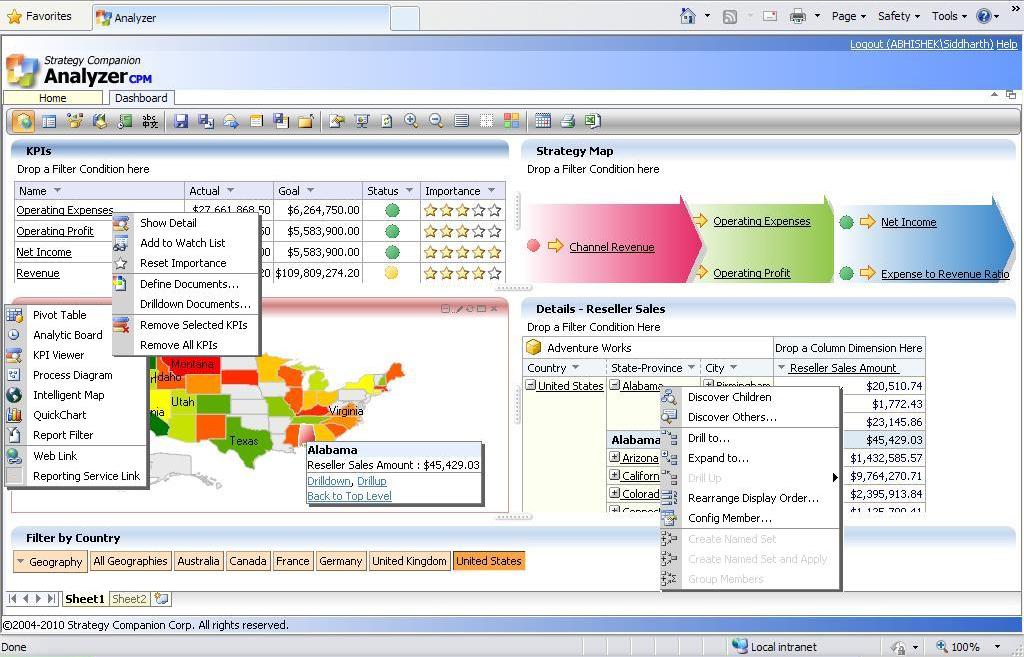
Report Authoring: I had Analyzer and the AdventureWorks cube on the same machine. Once you start Analyzer and create a new report, you would find the interface as visible in the below screenshot. To author the report, entire functionality is available on the toolbar or from context-sensitive menus. Plotting data on controls is a matter of drag-and-drop from the data tab visible on the left side.

Click to enlarge image For all the points described above in the requirements section, out-of-box controls are available.

1) KPI Viewer - This control be used for creating a scorecard hosting KPIs. Also you would find some very interesting columns like "Importance" out-of-box which can be quite an effort to create in PerformancePoint Services.

2) Process Diagram - This control can be used to create a basic level strategy map. Though this strategy map is not as appealing as a Strategy Map created out of a data-driven diagram in Visio, but still its fine enough for a last minute dashboard. Also it can host my KPIs there too.

3) Intelligent Map - This can be considered synonymous to what Bing Maps control is to SSRS. It's completely configurable and contains wide variety of maps ranging from World Map to area-specific maps.

4) Pivot Table - This control is perfectly suitable for OLAP reporting in a grid based UI.

5) Filters - Report filter have a very different UI, than traditional UI of a drop-down. Though it occupies more real-estate of screen space, it makes the report more appealing, so it's worth it. Considering the present scope of this report, I chose to place the filters at the bottom of the page, instead of placing it at the top.

You can see at the bottom of these screenshots that each report or dashboard in Analyzer can contain multiple sheets (no limit) each of which can contain its own combination of controls such as pivot tables, maps, charts, etc. In this example we are only using one sheet.

Click to enlarge imageCheck out the context menus of all these different controls, and you can see what different options are available with each control. On selecting "Discover Children" at "Alabama" level in pivot table, a different sheet opens up with this wonderful report and UI, as shown in the below screenshot.

Click to enlarge image
Summary: With out-of-the-box controls, drag-and-drop functionality, a very decent looking report can be created in less than 60 minutes, to target the senior most audience of an organization who expect a report that supports decision making with its analytical capabilities. Provided your cube is ready with all the data structures like KPIs, Named Sets, Hierarchies, Measures, etc., reporting is almost taken care of if Analyzer is available at your disposal. A phrase that suits the summary is "Keep your ducks in a row" i.e. have your cube in proper shape to support your reporting, and then using Analyzer, below is the result that I was able to achieve in less than an hour, with very little experience using Analyzer beforehand. A more experienced Analyzer user could no doubt build this kind of report even faster.


Click to enlarge image

Related Posts with Thumbnails